

14+ Blended Warm Tone Coasters for Autumn Decor
Blended warm tone coasters capture the cozy hues of autumn. Think amber, rust, and burnt orange fading together beautifully.
These hand-painted designs bring seasonal warmth to your tablescape effortlessly.
1. Burnt Orange and Amber Blend

Soft transitions between burnt orange and amber create a glowing fall-inspired effect.
Pro Tip: Use a damp brush to merge colors gently before they dry.
2. Rust and Ochre Gradient Coasters

Rust and ochre shades mimic autumn leaves with rich, earthy warmth.
Pro Tip: Layer the lighter color first, then blend in the darker shade for balance.
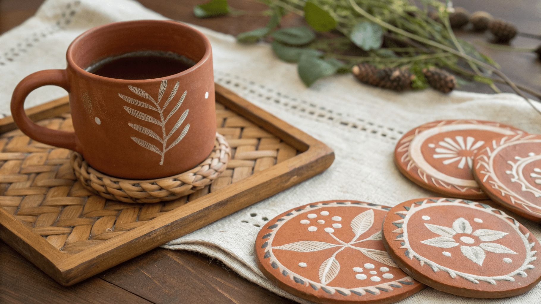
3. Terracotta and Gold Tones

Subtle terracotta with a hint of gold shimmer adds rustic charm to fall décor.
Pro Tip: Add a small touch of metallic paint to highlight edges.
4. Deep Red and Caramel Blend

Warm red tones fading into caramel brown evoke cozy evening hues.
Pro Tip: Blend with circular brush motions for a smooth transition.
5. Pumpkin and Sand Ombre

Muted pumpkin tones blending into sand create a soft, seasonal palette.

Pro Tip: Work in layers — start with the base tone, then lightly add contrast.
6. Amber and Cream Wash

Light amber merging into creamy tones gives a calm and sophisticated autumn vibe.
Pro Tip: Use a wide flat brush to spread colors evenly.
7. Chestnut and Rust Streaks

Dynamic brushstrokes in chestnut and rust add warmth and texture to the design.
Pro Tip: Alternate brush directions for a natural, hand-painted look.
8. Golden Brown Fade

A seamless blend of golden brown tones brings a sunlit touch to your fall table.
Pro Tip: Apply a matte finish to enhance the soft, rustic texture.
9. Copper and Sand Swirls

Copper blending into sandy beige creates a modern yet autumnal look.

Pro Tip: Swirl wet paint with a stick for organic, flowing patterns.
10. Warm Honey Gradient

Honey and light caramel tones flow together to create a soft, glowing effect.
Pro Tip: Mix a drop of white paint to make the gradient smoother and softer.
11. Blended Maple and Amber Shades

Maple red with amber undertones adds a rich fall feel to your coasters.
Pro Tip: Work quickly while paint is wet for smoother blending.
12. Muted Terracotta Mix

Soft terracotta and clay hues create an earthy, timeless autumn palette.
Pro Tip: Finish with a satin sealant for a subtle sheen.
13. Golden Yellow and Burnt Sienna Duo

Golden yellow blending into burnt sienna captures the heart of autumn.
Pro Tip: Blend with a sponge for a soft, seamless finish.
14. Deep Brown and Orange Blend

Rich brown fading into muted orange gives a grounded, cozy finish.
Pro Tip: Keep brush pressure light to avoid harsh streaks.
Final Thoughts
Blended warm tone coasters bring the beauty of autumn indoors with every stroke. Their natural gradients and cozy hues transform any dining table into a seasonal masterpiece.
- 12 Small Guest Room Ideas People Love - March 13, 2026
- 18 Thoughtful Guest Room Ideas Your Friends and Family Will Appreciate - March 13, 2026
- 16 Easy Ways to Make Your Guest Bedroom Feel More Inviting - March 13, 2026