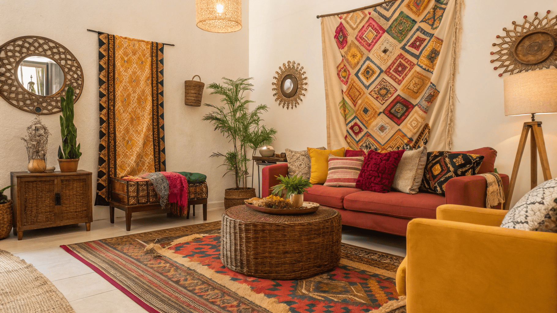
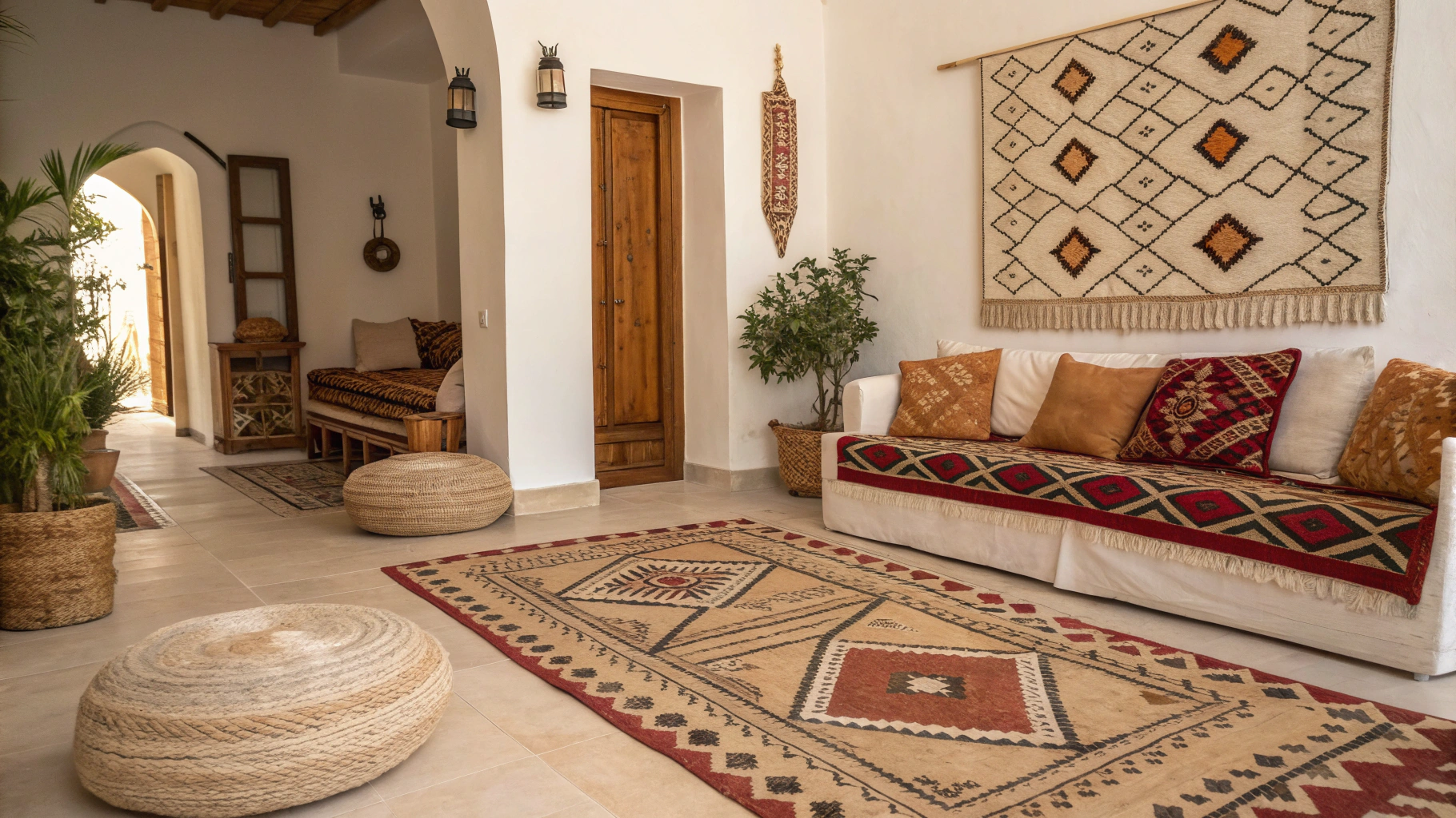
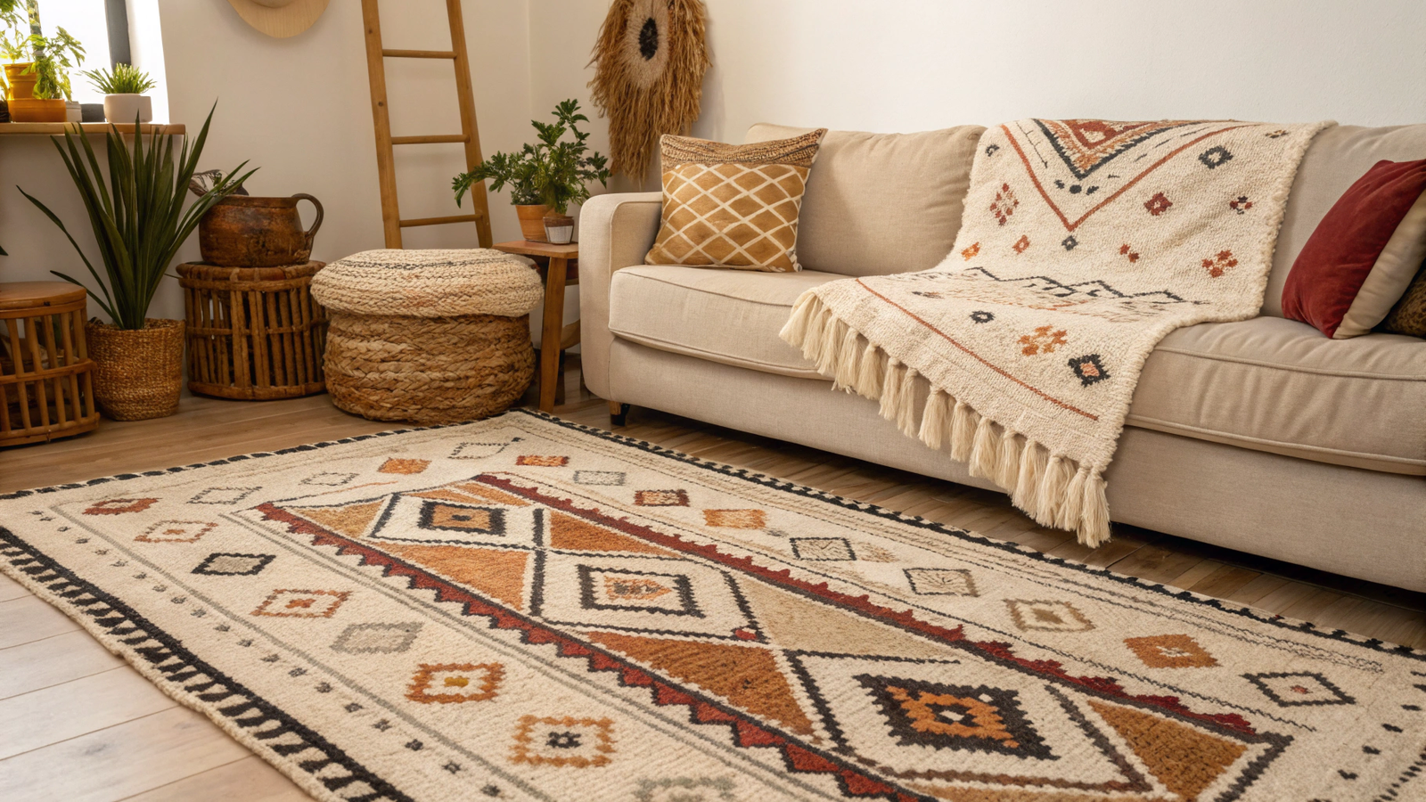
15+ Afrobohemian Color Palettes Designers Actually Trust
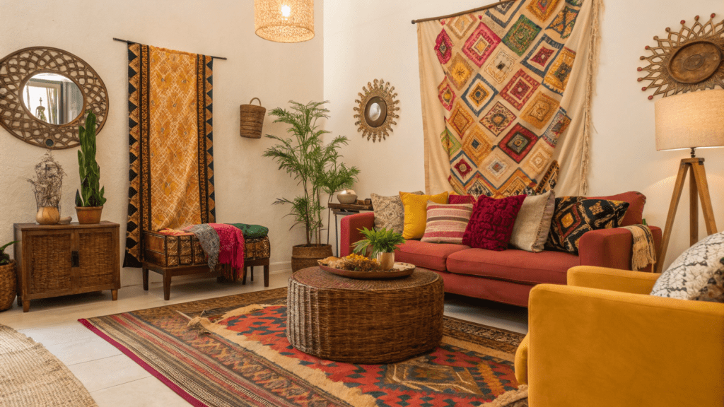
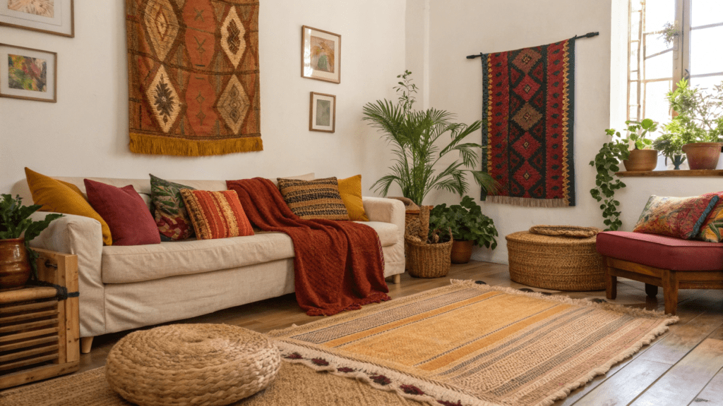
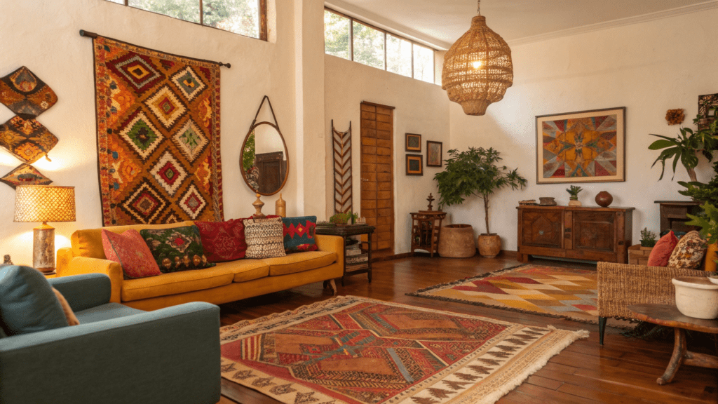
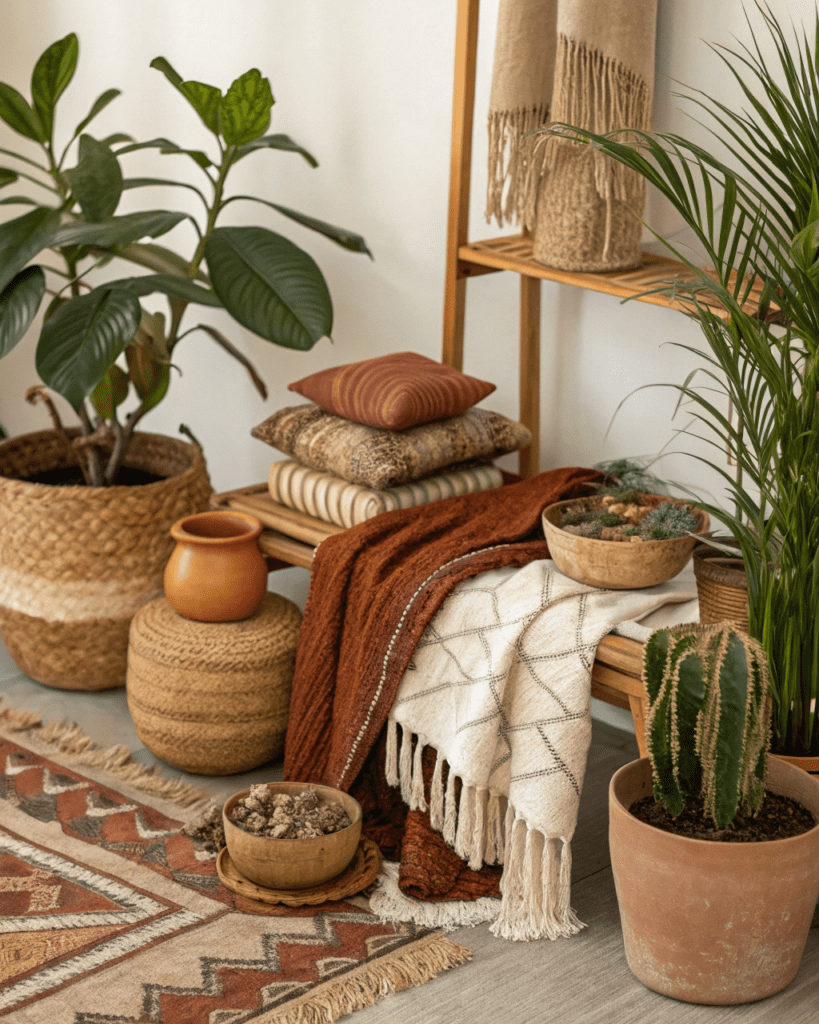
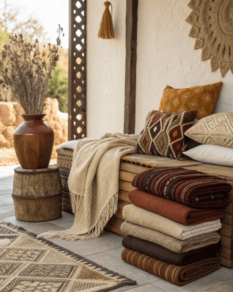
Afrobohemian color palettes are not loud for the sake of being bold. Designers trust palettes that feel grounded, layered, and timeless. These colors come from nature, heritage, and lived spaces, not from fast trends. The goal is warmth, depth, and harmony that allows textures and materials to shine.
Here are Afrobohemian color palettes designers actually use because they age well and feel authentic.
1. Warm Beige and Soft Black
Use this palette to create contrast without harshness.
Works well with:
- Natural wood
- Textured textiles
2. Clay and Cream
Use clay tones to ground the space and cream to soften it.
Pair with:
- Handmade ceramics
- Woven accents
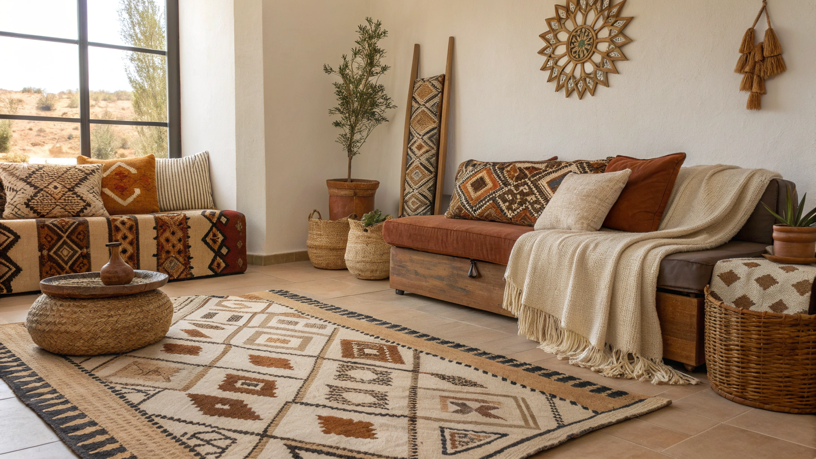
3. Sand and Deep Brown
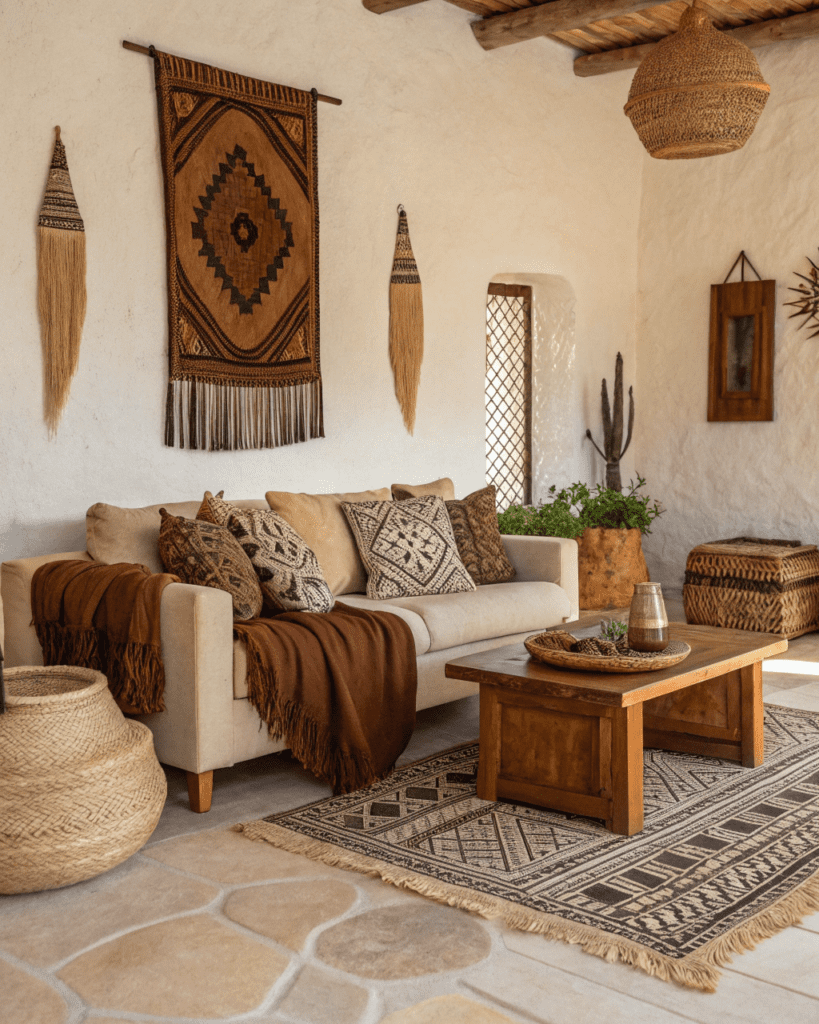
Use sand as the base and brown for depth.
Layer with:
- Leather
- Dark wood
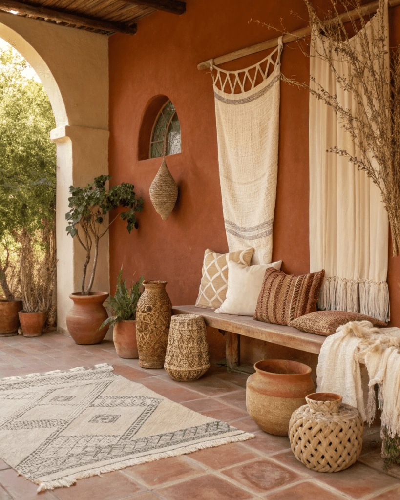
4. Terracotta and Warm White
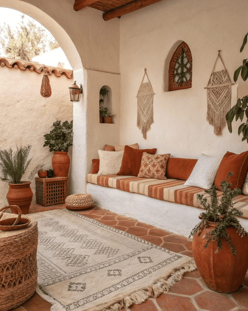
Use terracotta to add warmth without overpowering.
Balance with:
- White walls
- Neutral upholstery
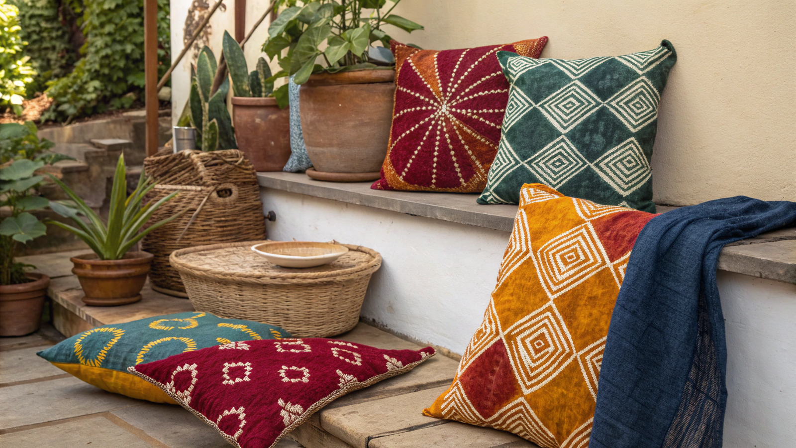
5. Ochre and Soft Charcoal
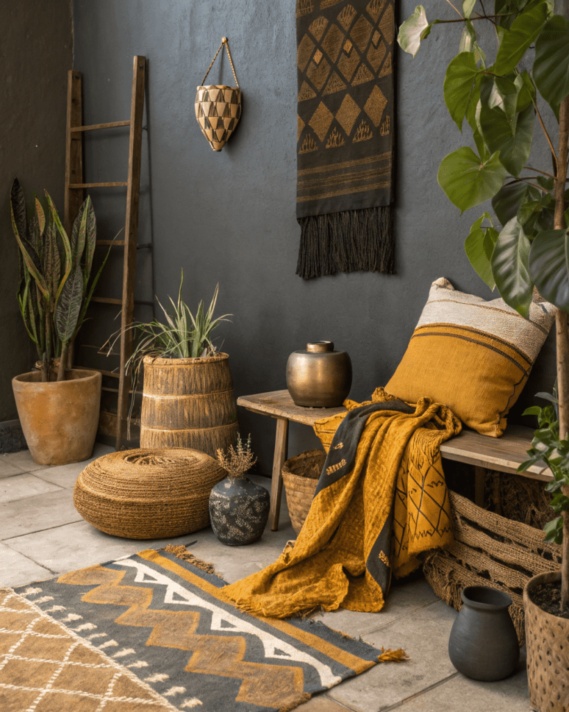
Use ochre as an accent rather than a base.
Add through:
- Cushions
- Art
- Small decor
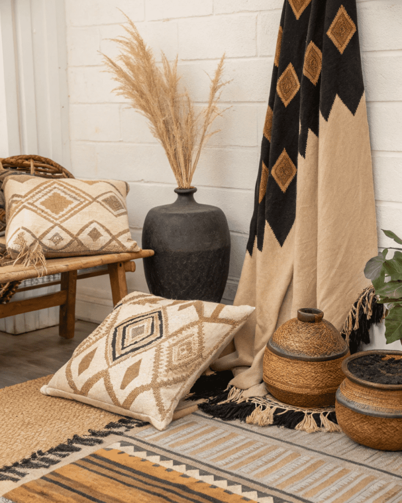
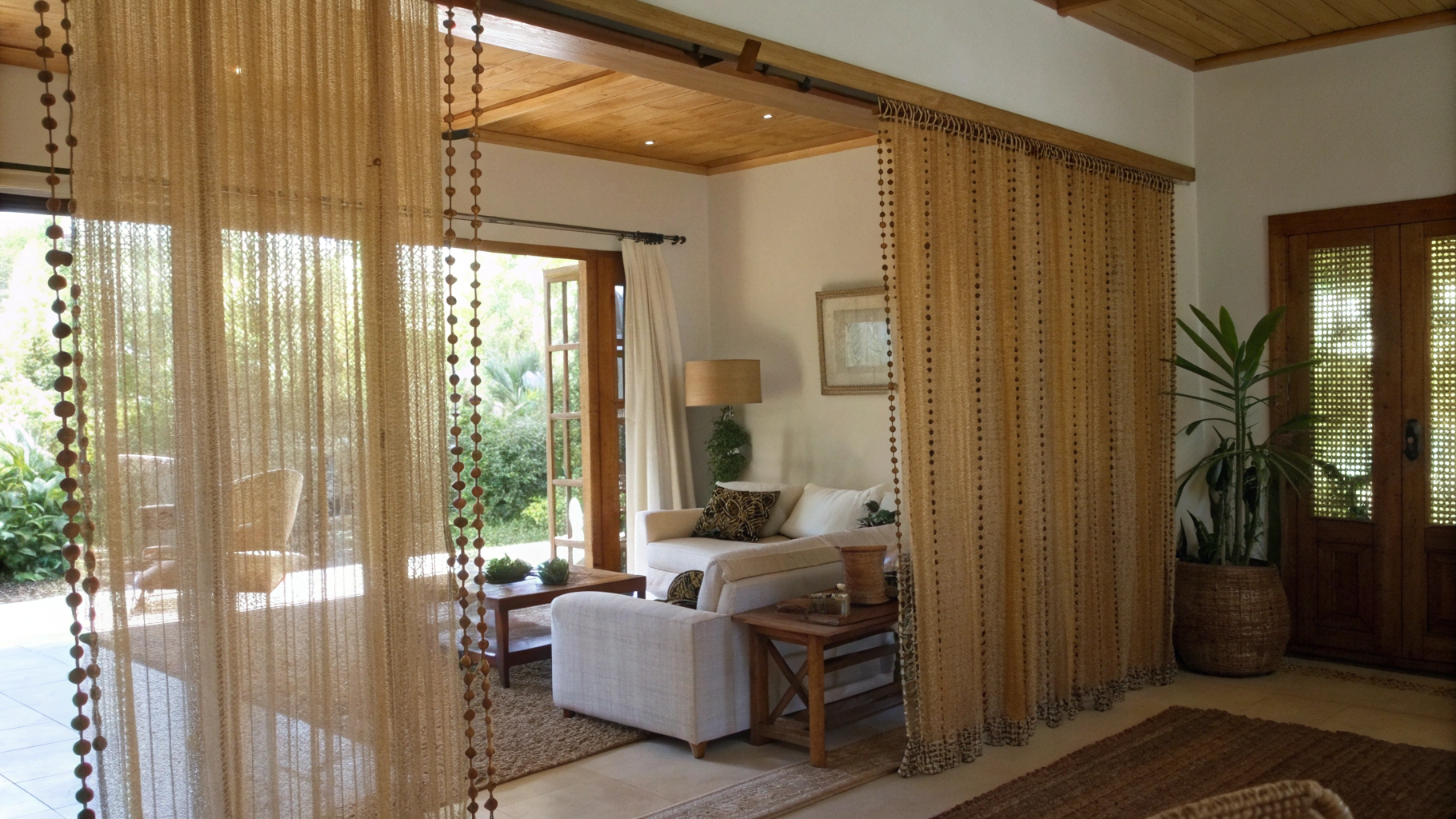
6. Muted Black and Natural Linen
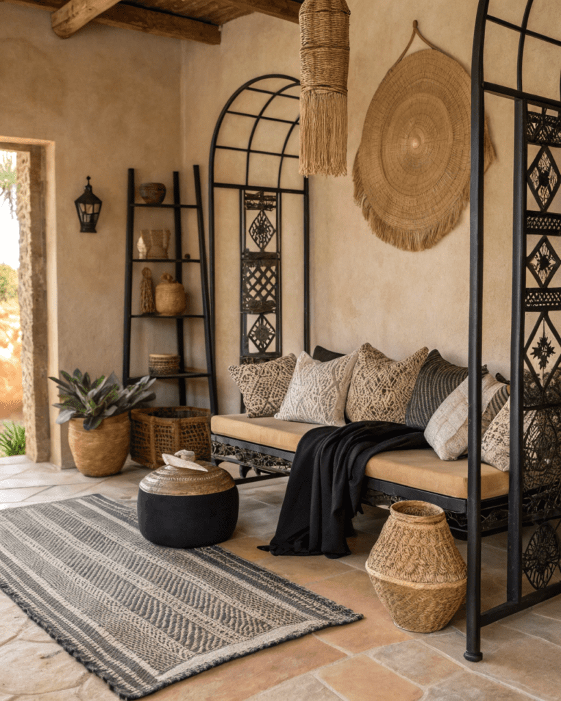
Use black sparingly for structure.
Soften with:
- Linen textiles
- Light wood
7. Olive Green and Beige
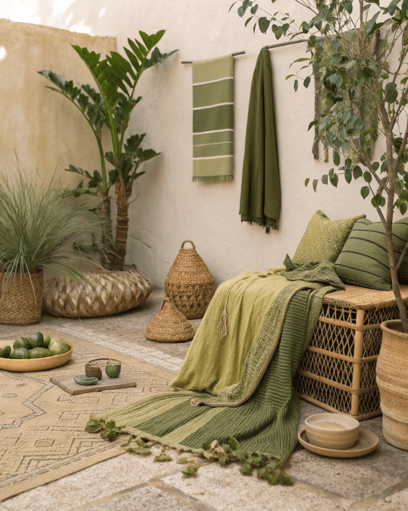
Use olive to bring in nature gently.

Pair with:
- Stone
- Raw wood
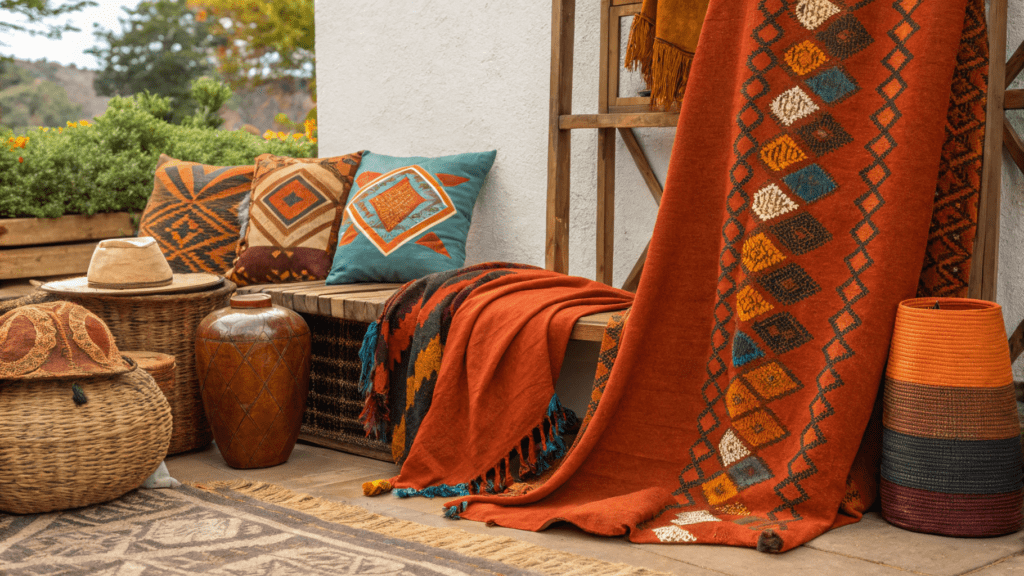
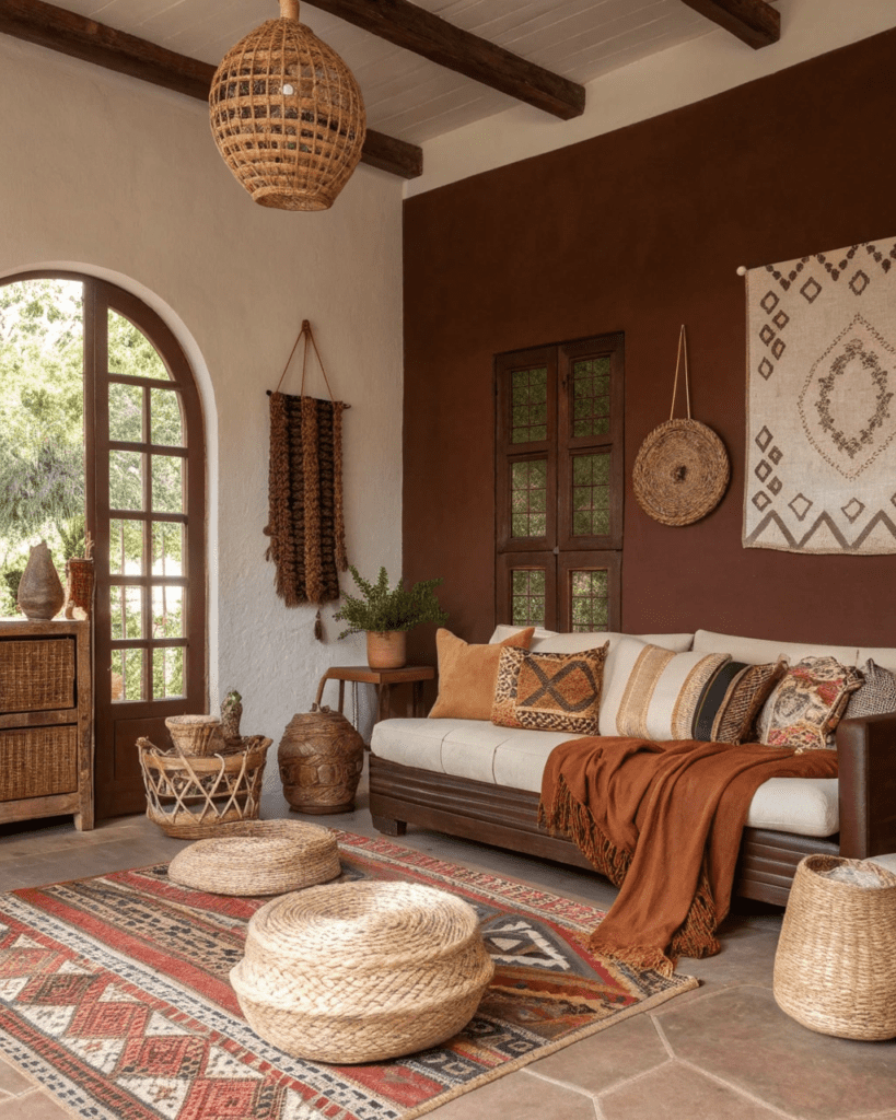
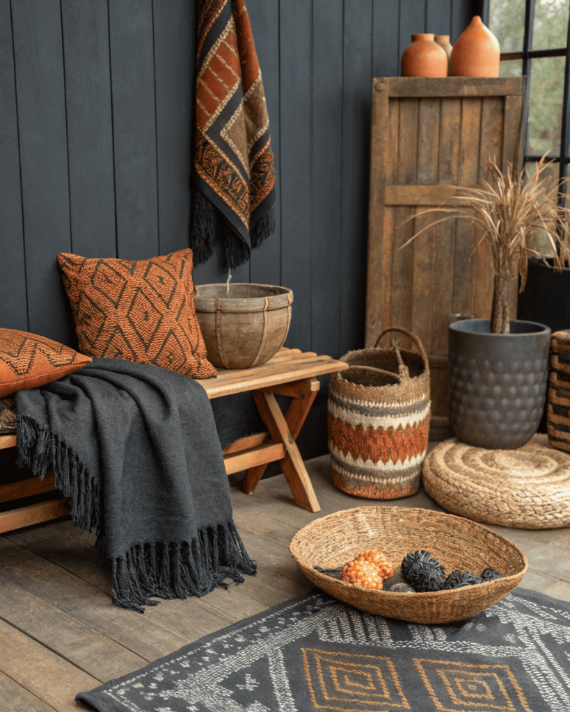
8. Rust and Warm Taupe
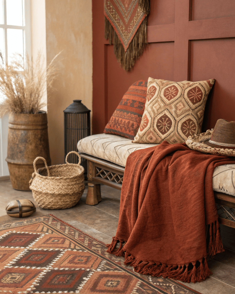
Use rust for richness without brightness.
Balance with:
- Taupe walls
- Neutral rugs
9. Deep Brown and Off-White
Use brown to anchor the room.
Lift with:
- Off-white walls
- Light textiles
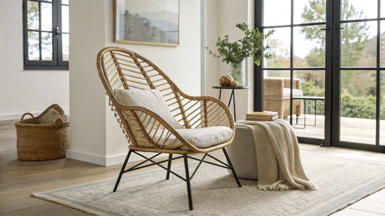
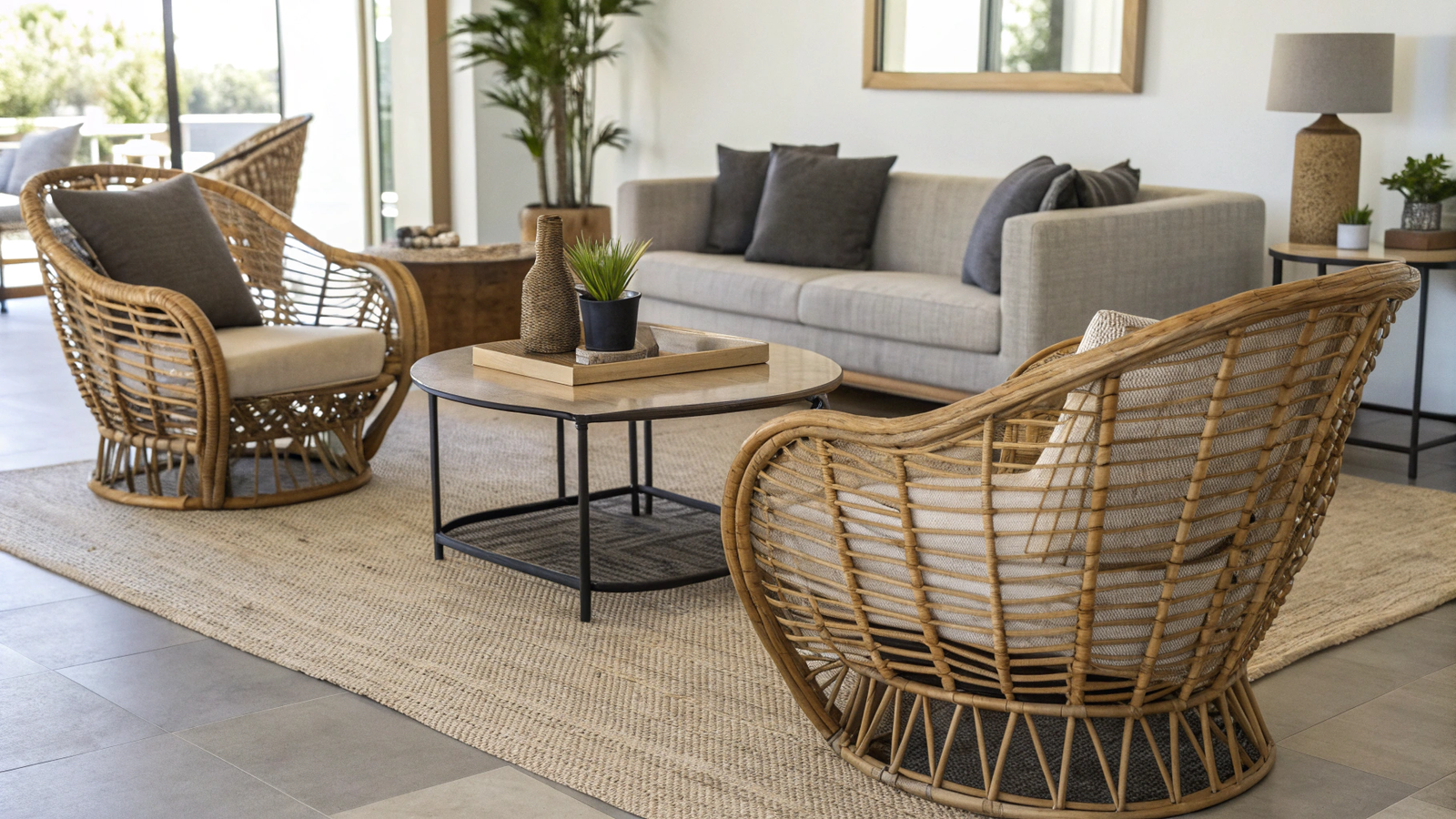
10. Soft Grey and Earthy Brown
Use grey only when it leans warm.
Pair with:
- Earth-toned decor
- Textured fabrics
11. Muted Indigo and Sand
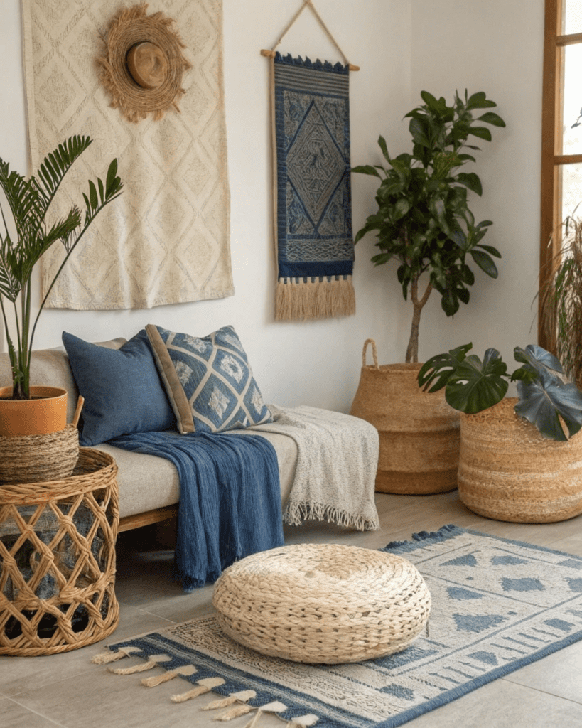
Use indigo as a subtle accent.
Add through:
- Textiles
- Framed fabric art
12. Camel and Cream
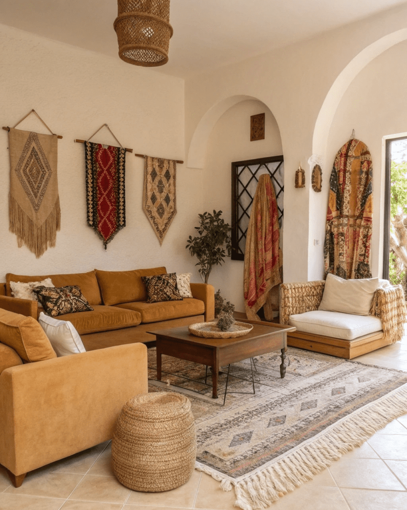
Use camel for furniture or rugs.
Support with:
- Cream walls
- Light accessories
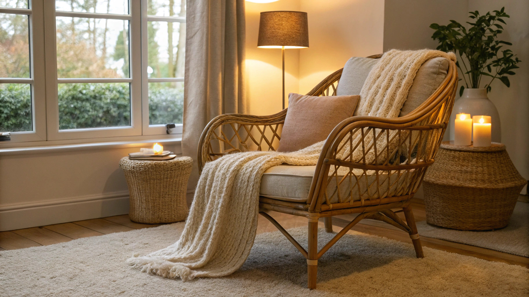
13. Charcoal and Warm Wood
Use charcoal for depth without heaviness.
Balance with:
- Warm wood finishes
- Soft lighting
14. Natural White and Aged Black
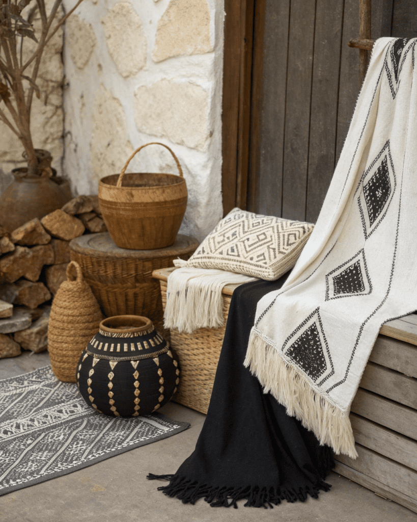
Use aged black instead of sharp black.
Pair with:
- Vintage elements
- Patinated metals
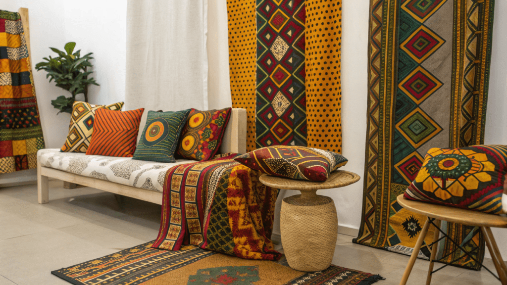
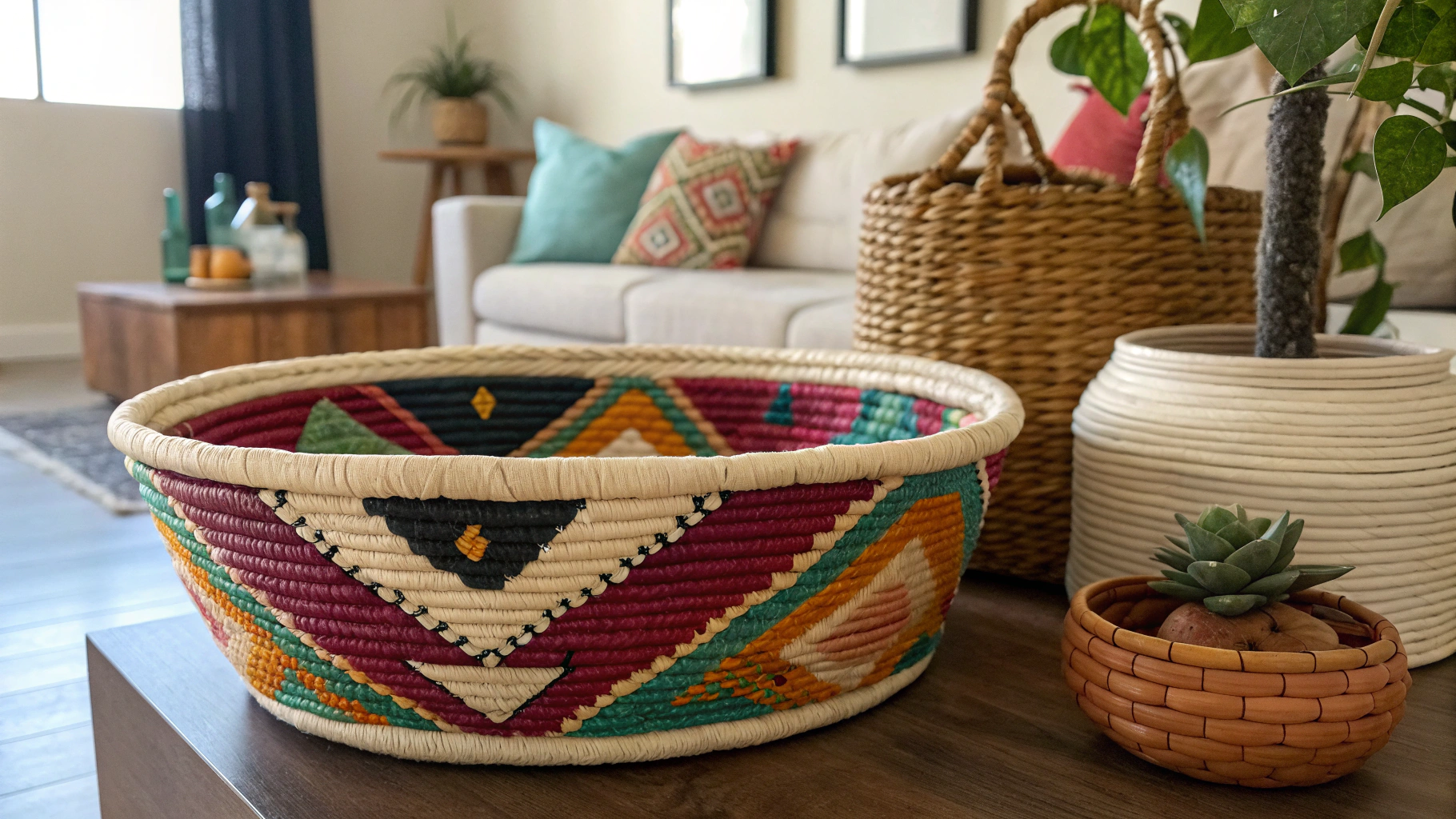
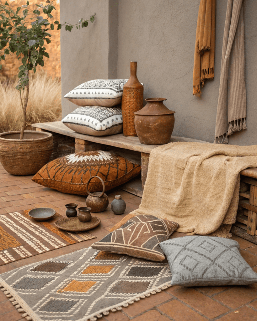
15. Earthy Neutrals Layered Together
Designers often trust combinations, not pairs.
Layer:
- Beige
- Brown
- Clay
- Soft black
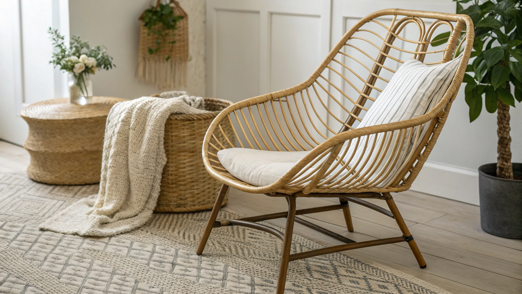
16. Monochrome Neutrals With Texture
Color stays simple, texture adds interest.
Use:
- Linen
- Wood
- Stone
Final Thoughts
Designers trust Afrobohemian color palettes that feel rooted and balanced, not dramatic for attention. By choosing warm neutrals, earthy tones, and soft contrast, these palettes create spaces that feel soulful, lived-in, and timeless. Afrobohemian color works best when it supports texture, story, and personal meaning rather than stealing focus.
FAQs
Why do designers prefer earthy Afrobohemian palettes?
Because they age well and work with natural materials.
Can Afrobohemian color palettes work in small homes?
Yes. Warm neutrals with depth actually make spaces feel calmer and more cohesive.
Is black too harsh for Afrobohemian interiors?
Not when it is muted and balanced with warm tones.
How many colors should an Afrobohemian palette have?
Usually two to four main tones layered together.
Are bright colors part of Afrobohemian design?
Rarely. Designers prefer muted, earthy versions.
What is the biggest color mistake in Afrobohemian spaces?
Using trendy or overly saturated colors instead of grounded tones.
- Why Pantry Organization Never Lasts (And What Actually Works) - March 26, 2026
- How to Organize a Pantry That Has No Shelves (2026 Guide) - March 26, 2026
- How to Style a Staircase Landing as a Reading Nook Without Renovation (2026 Guide) - March 26, 2026