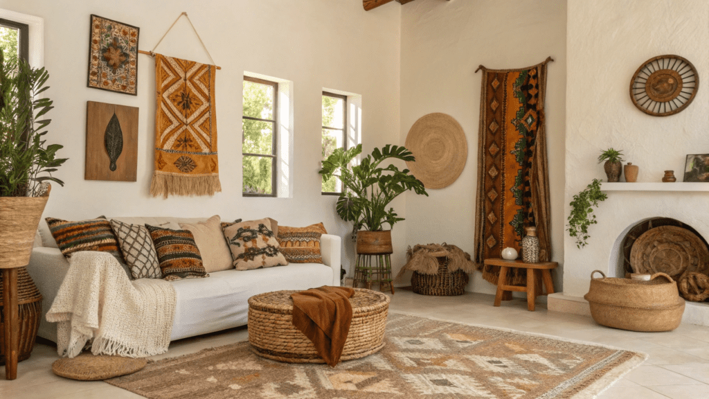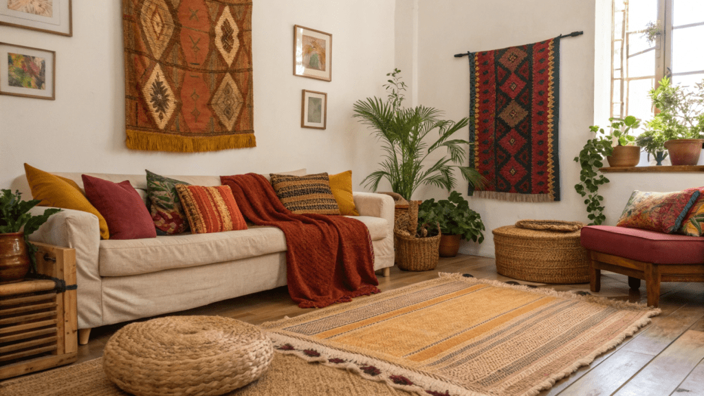
18+ Afrobohemian Texture Pairings Done Right
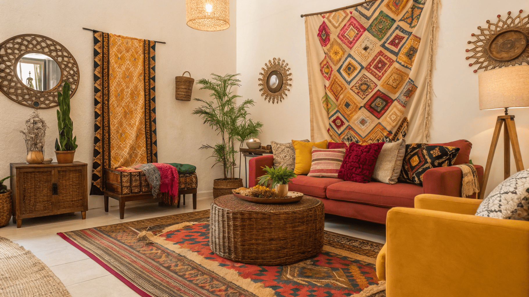
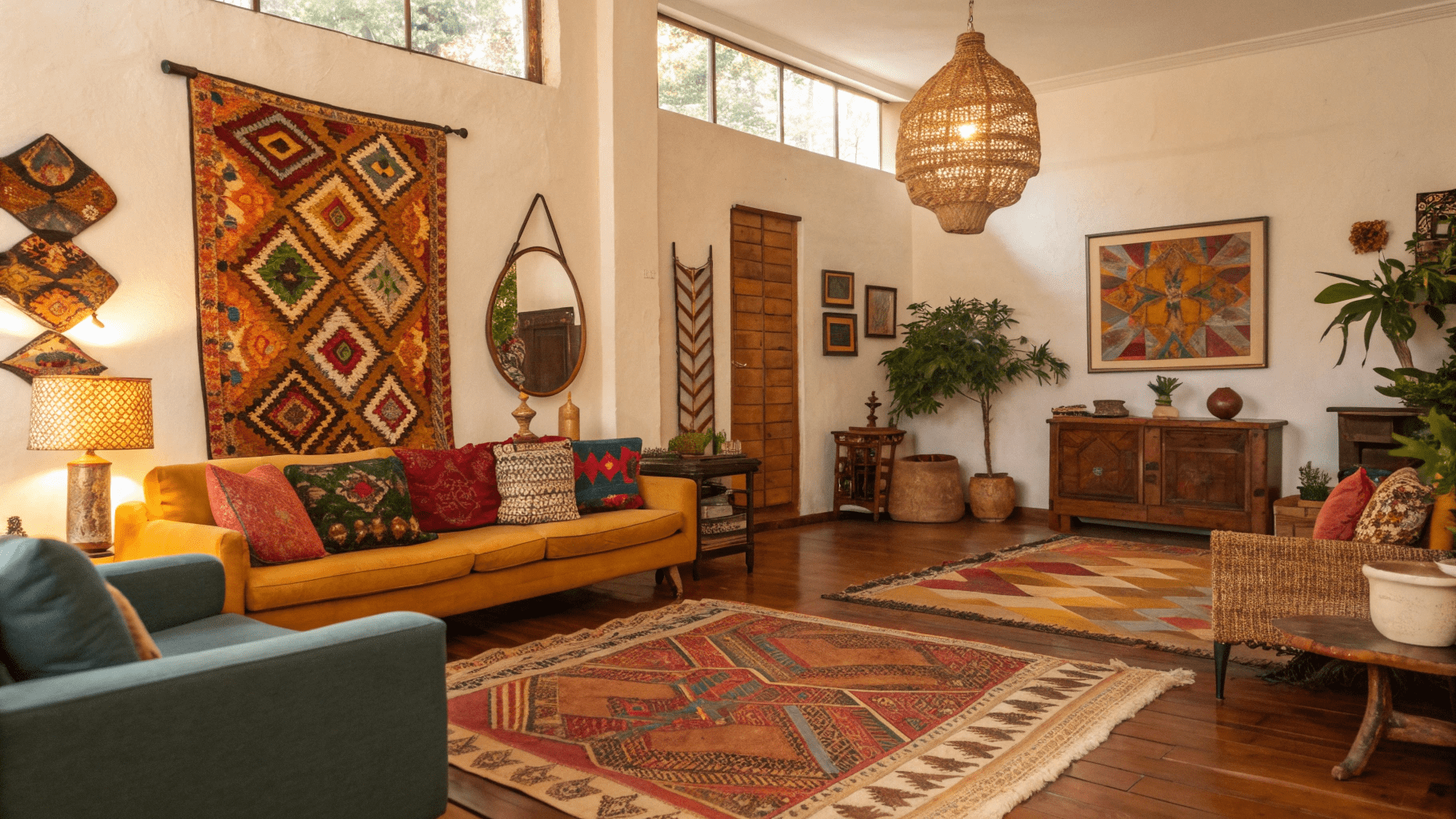
Afrobohemian style is built on texture more than color. The richness comes from how materials interact, rough with soft, woven with smooth, matte with slightly polished. When texture pairings are done right, even a neutral palette feels layered and alive. When done wrong, the space can feel flat or overly busy.
These Afrobohemian texture pairings show how to mix materials with intention so rooms feel soulful, balanced, and full of depth.
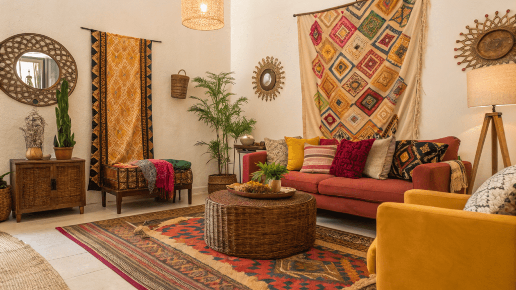
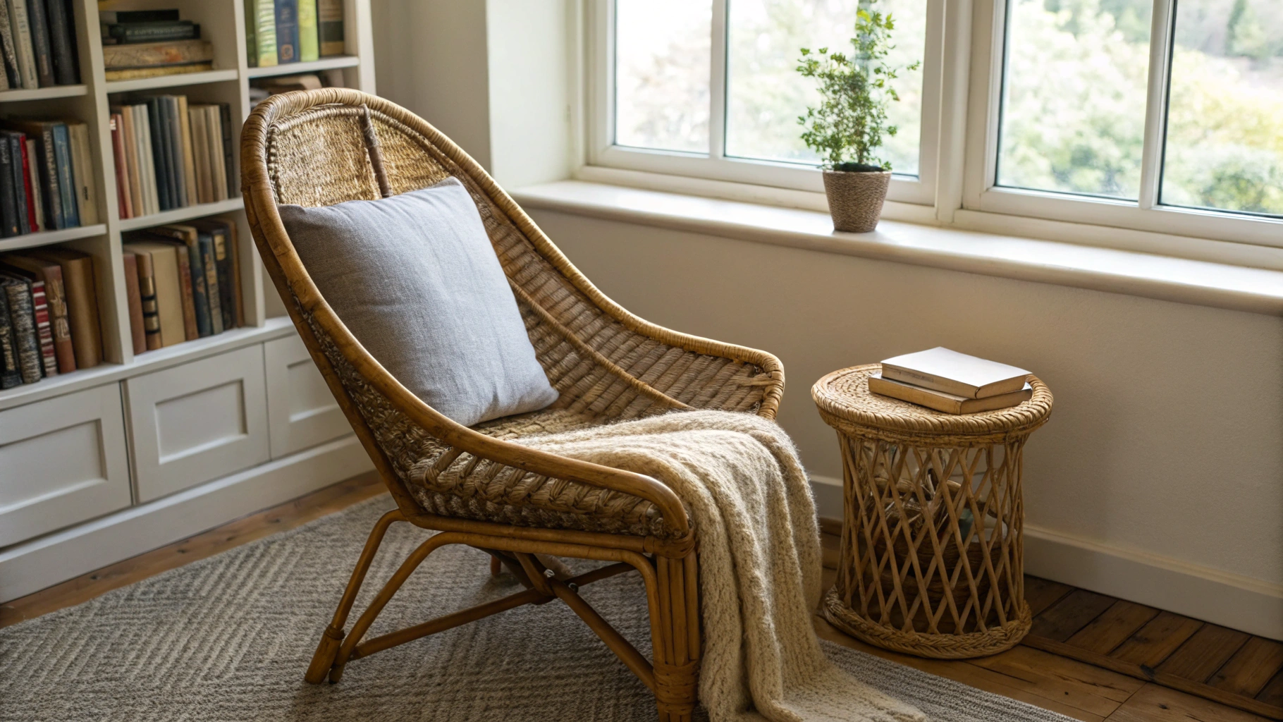
1. Raw Wood and Woven Fiber Pairing
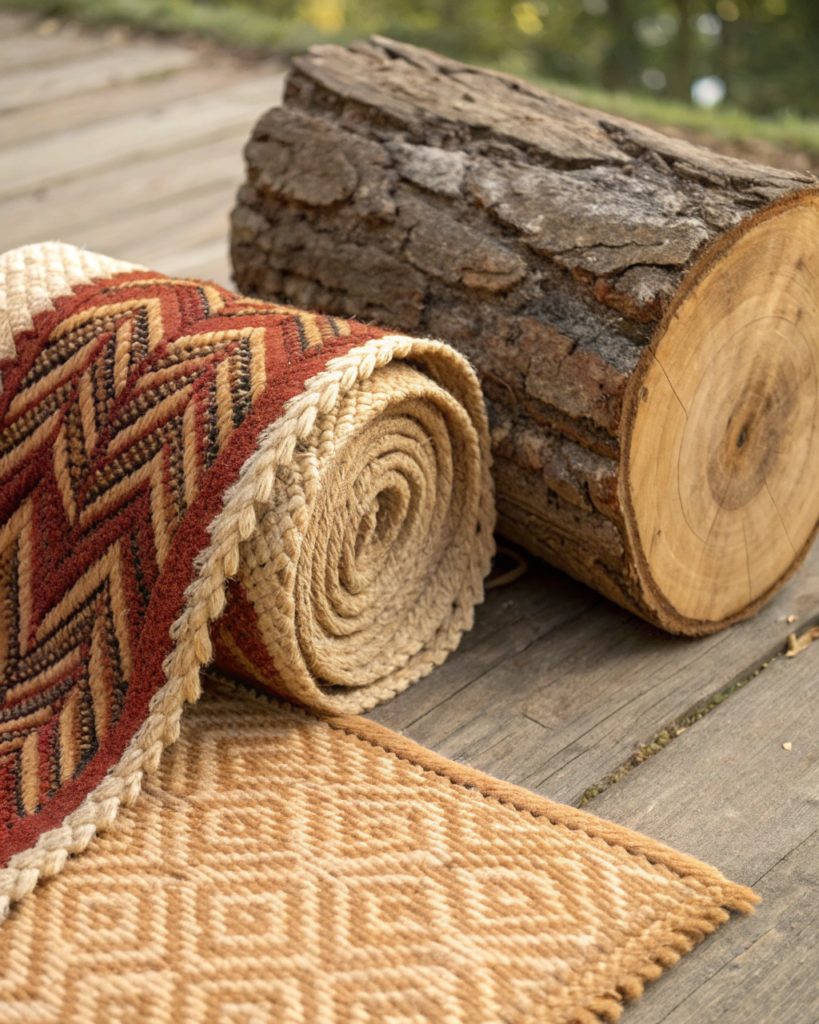
This is one of the most reliable Afrobohemian foundations.
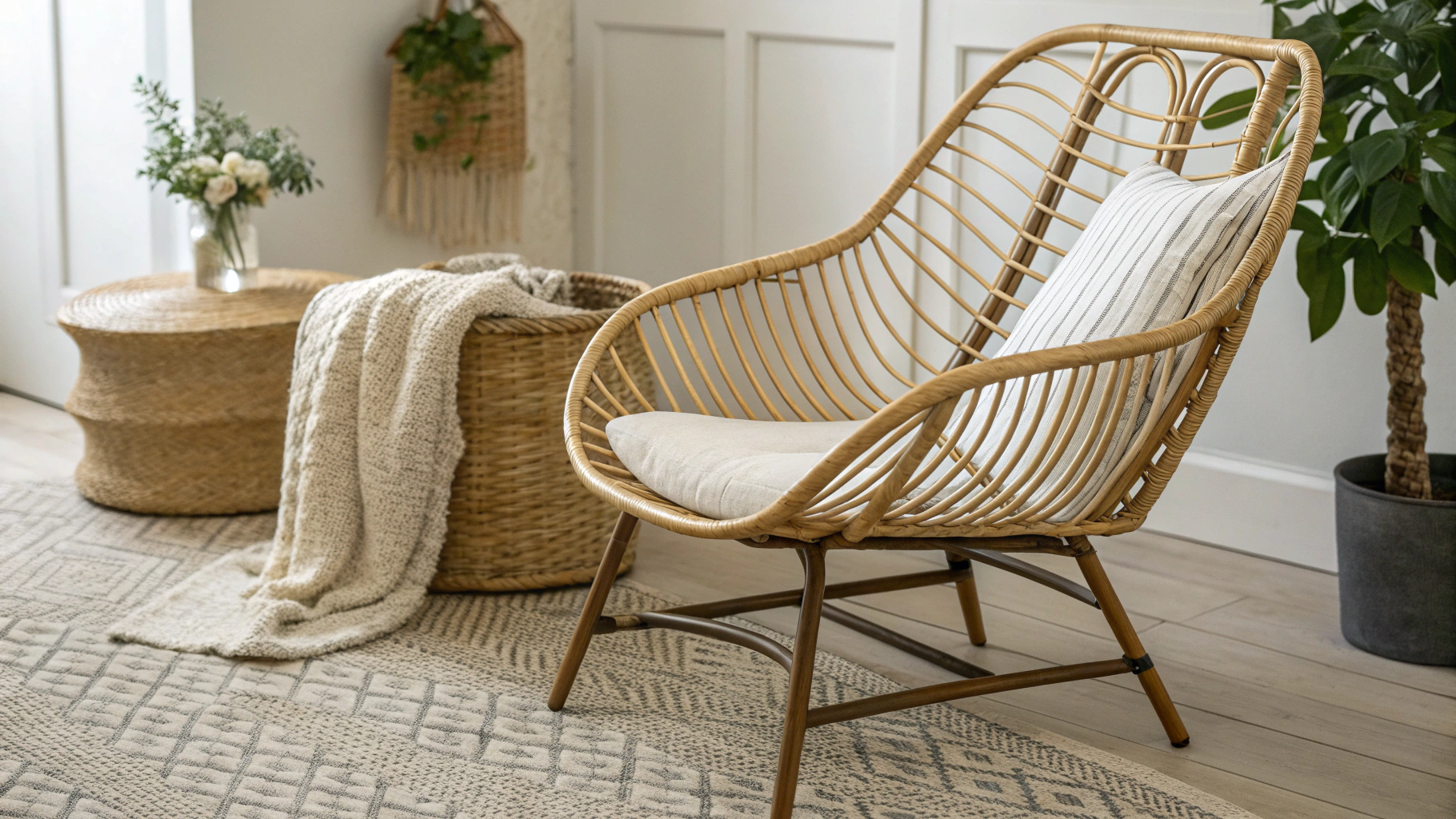
• Combine raw edge wood tables or stools with woven baskets or trays
• The grain and weave contrast creates instant visual depth
• Works in living rooms, entries, and dining areas
2. Clay Ceramics and Linen Textiles Pairing
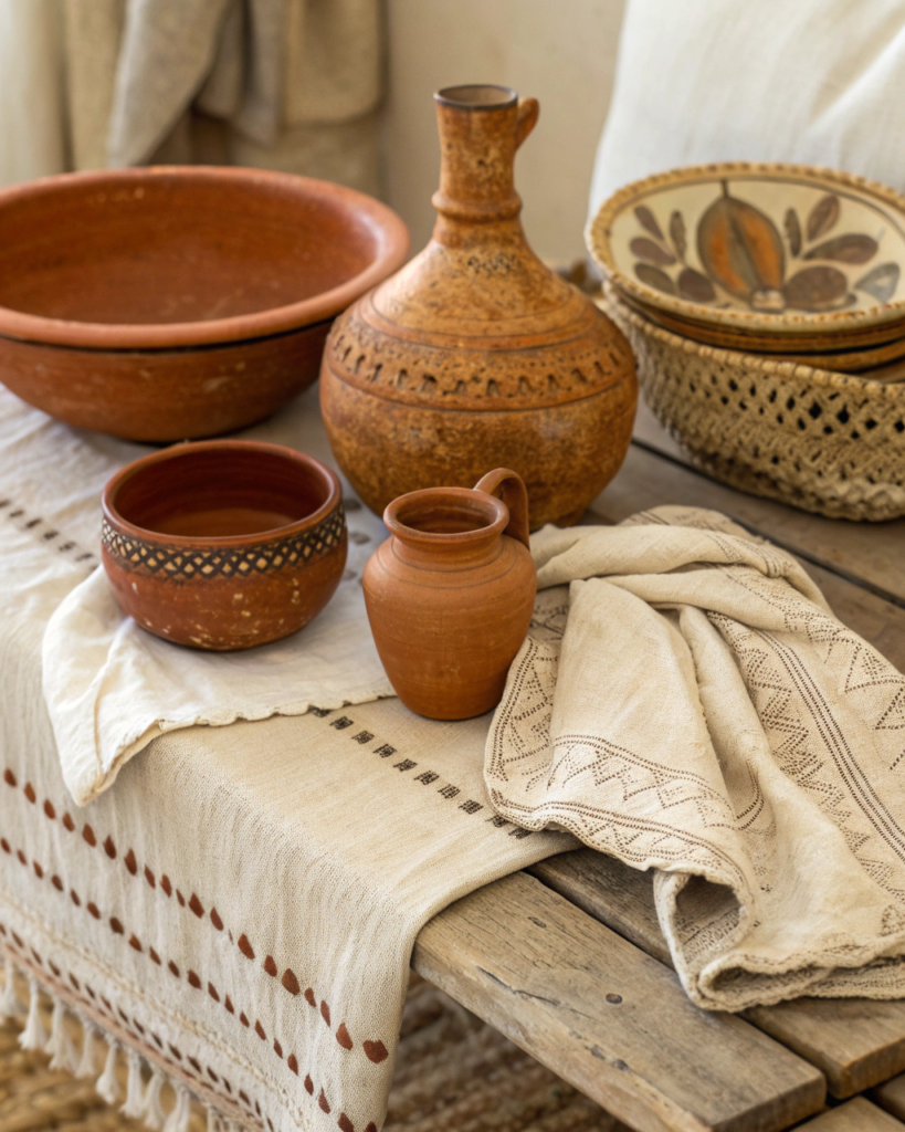
Earth formed plus soft fabric creates grounded calm.
• Use handmade clay vases with linen runners or cushions nearby
• Matte ceramic surfaces pair best with slightly rumpled linen
• Keep tones warm and muted for cohesion
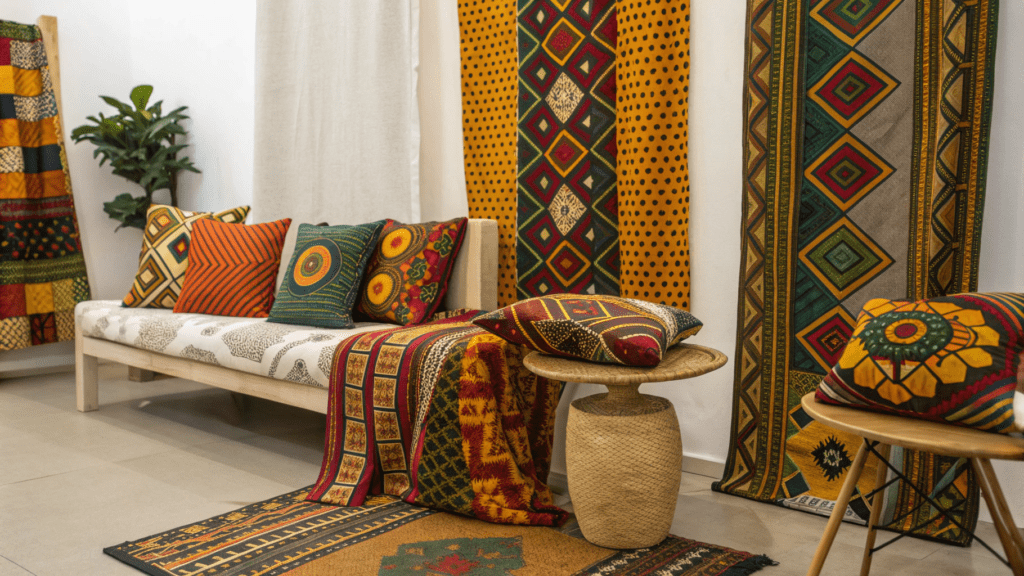
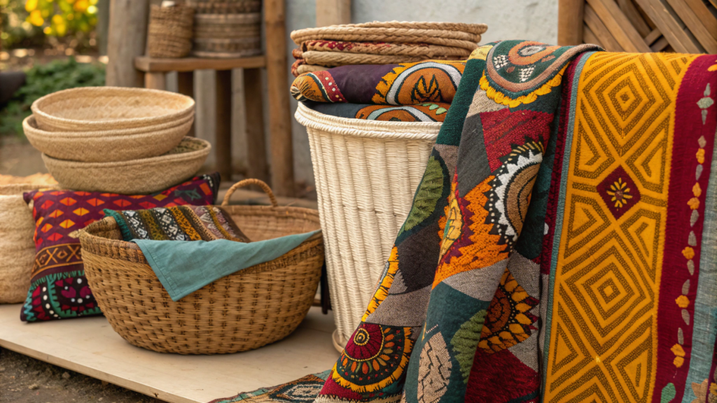
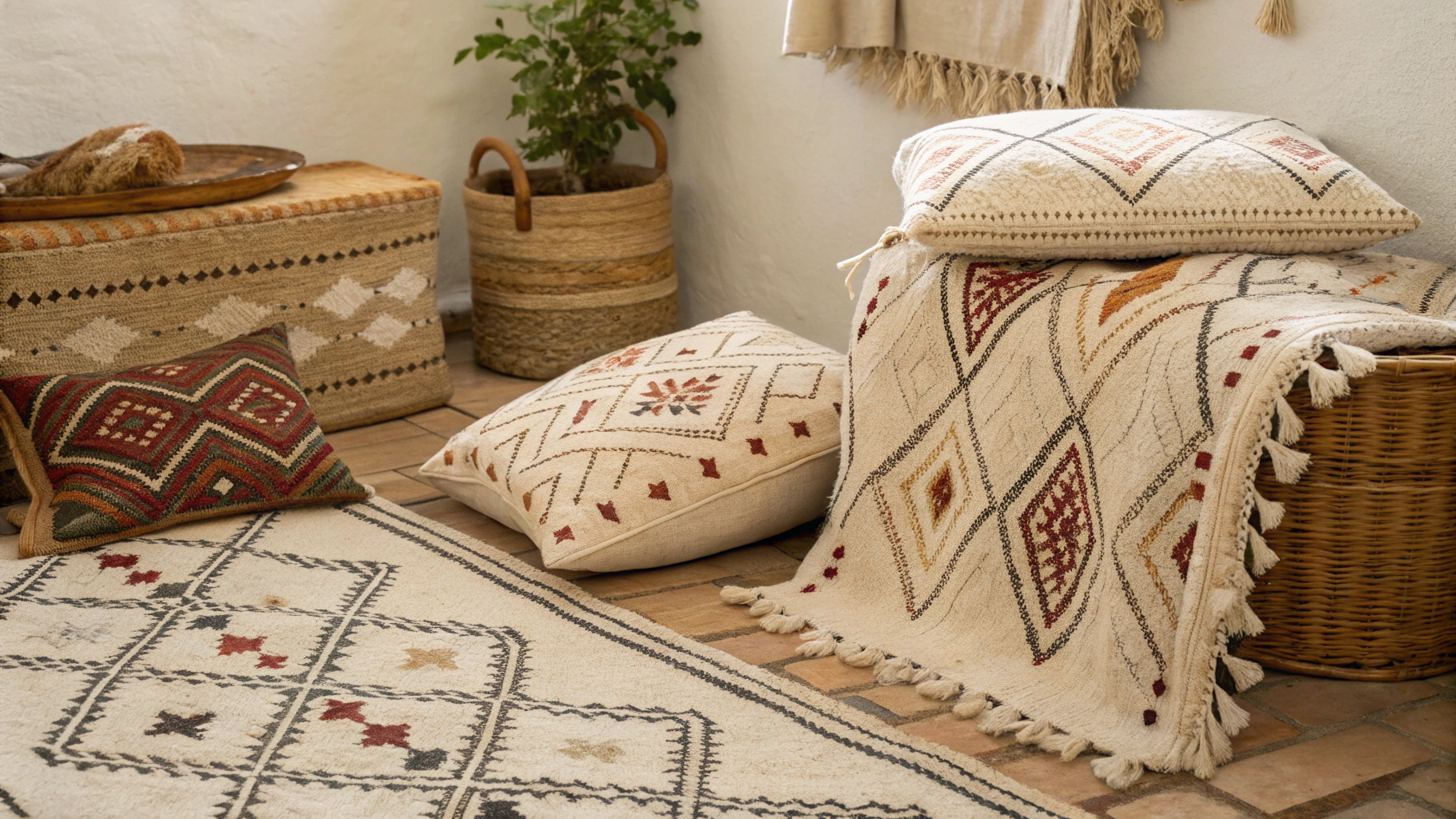
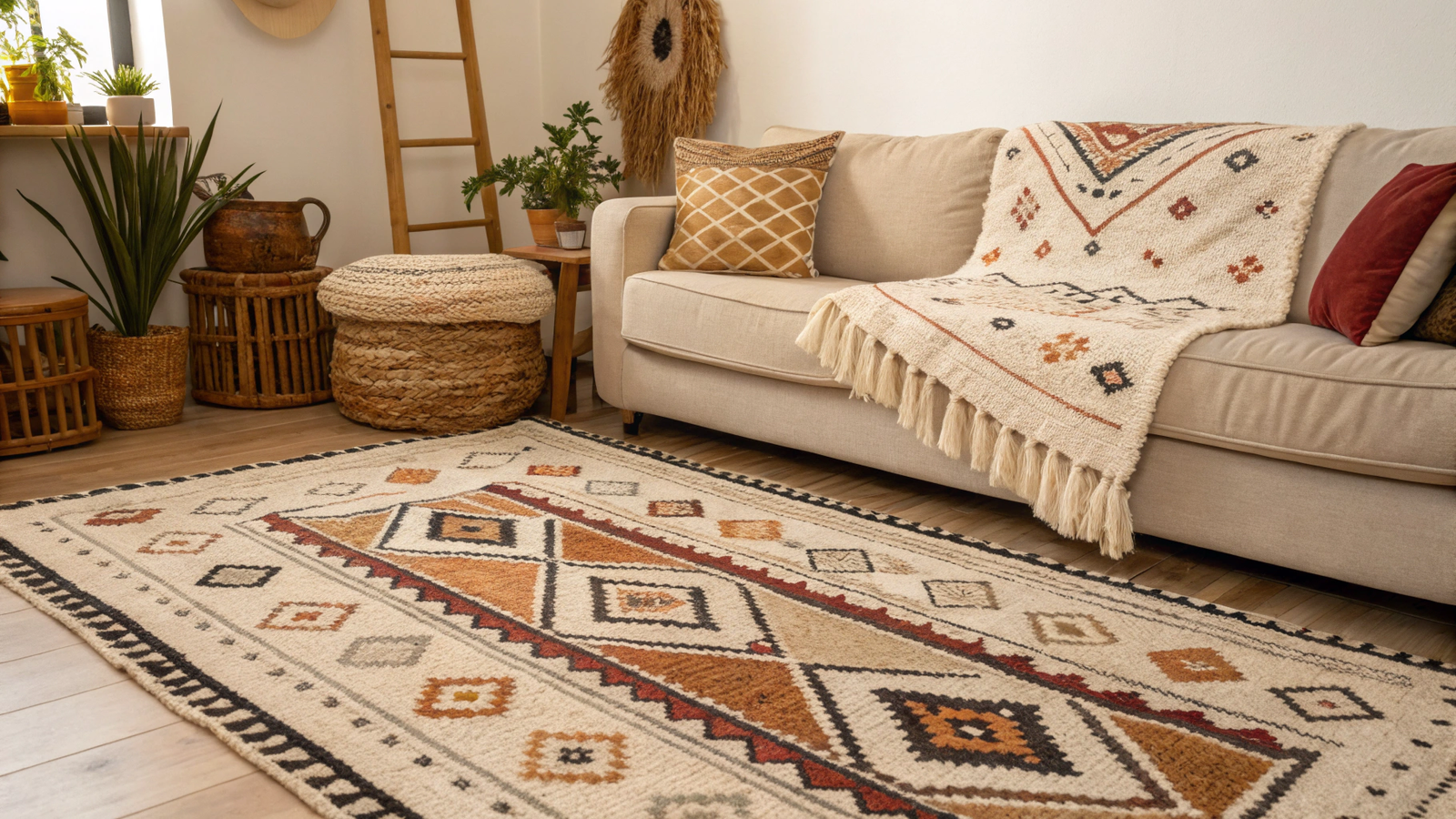
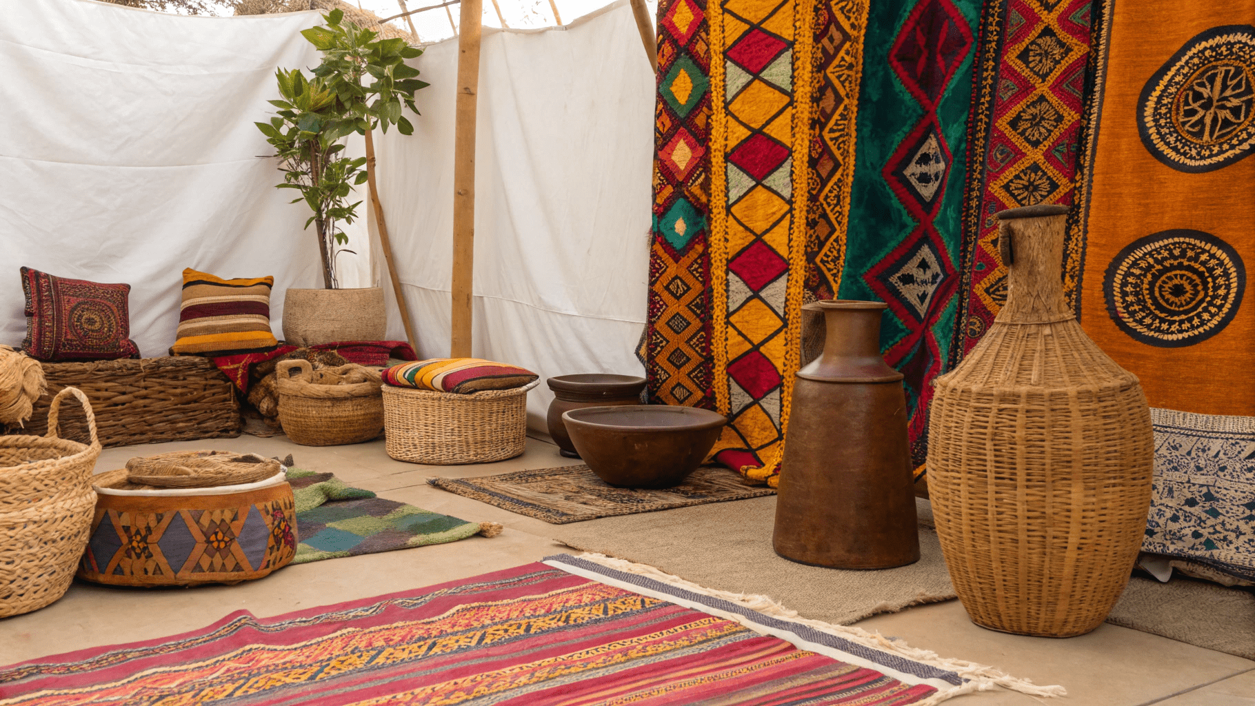
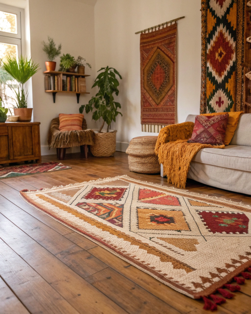
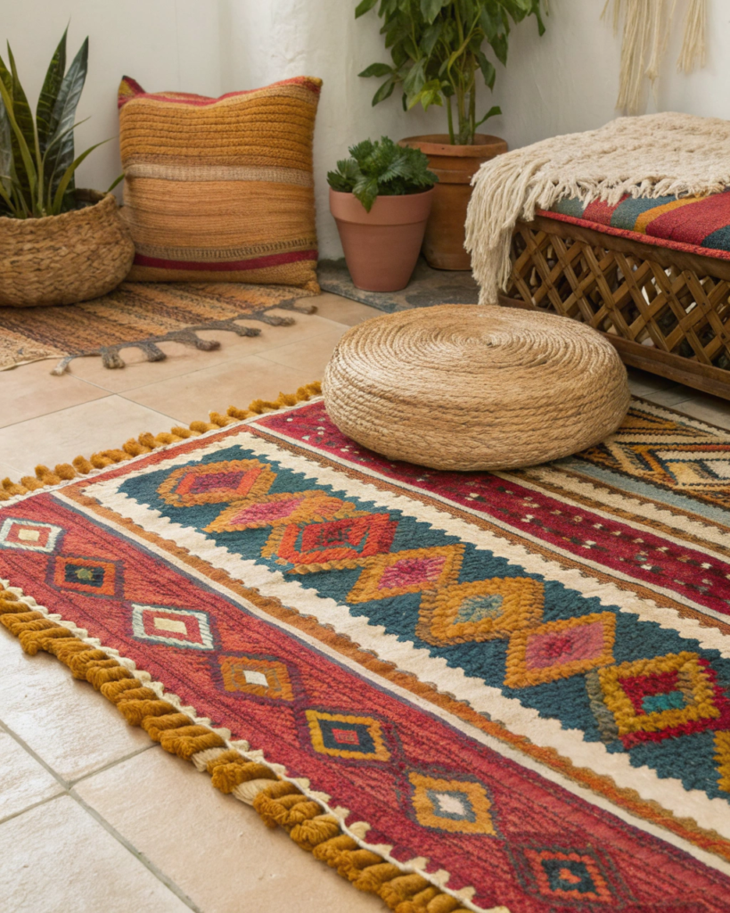
3. Jute Rugs and Patterned Cotton Pairing
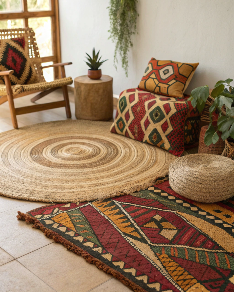
Strong base texture plus expressive pattern feels balanced.
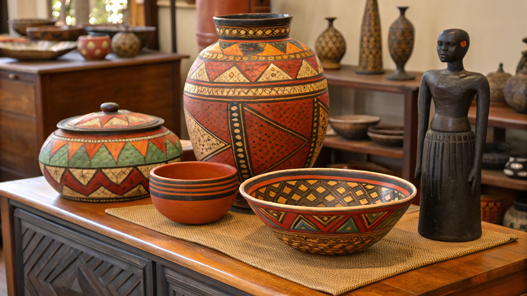
• Anchor floors with chunky jute rugs
• Layer patterned cotton or mudcloth style textiles above
• The rough base keeps bold pattern from overpowering
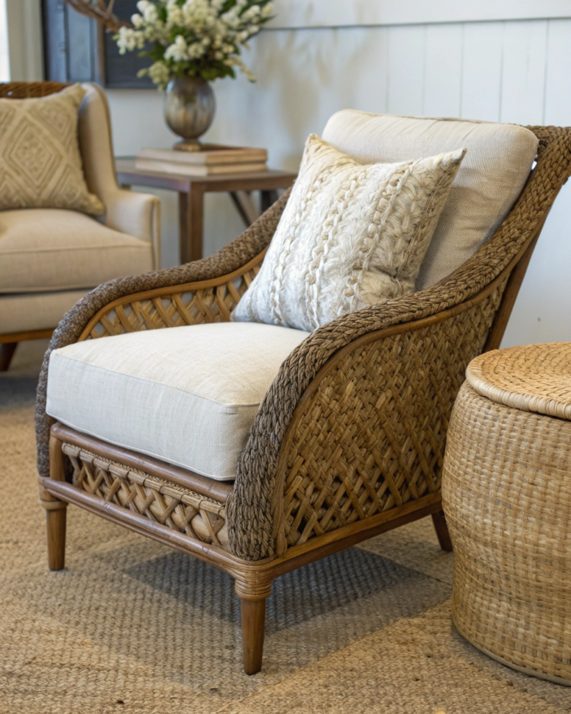
4. Carved Wood and Boucle Fabric Pairing
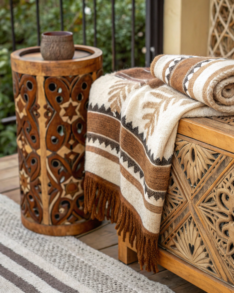
Hard sculptural detail plus soft looped fabric adds luxury warmth.
• Place carved chairs or objects near boucle seating
• The tactile contrast makes both textures stand out
• Best used in seating zones and reading corners
5. Matte Black Metal and Natural Wood Pairing
Structure plus warmth creates modern Afrobohemian tension.
• Use matte black lighting or frames with warm wood furniture
• Repeat both finishes across the room for unity
• Keeps organic spaces from feeling too rustic
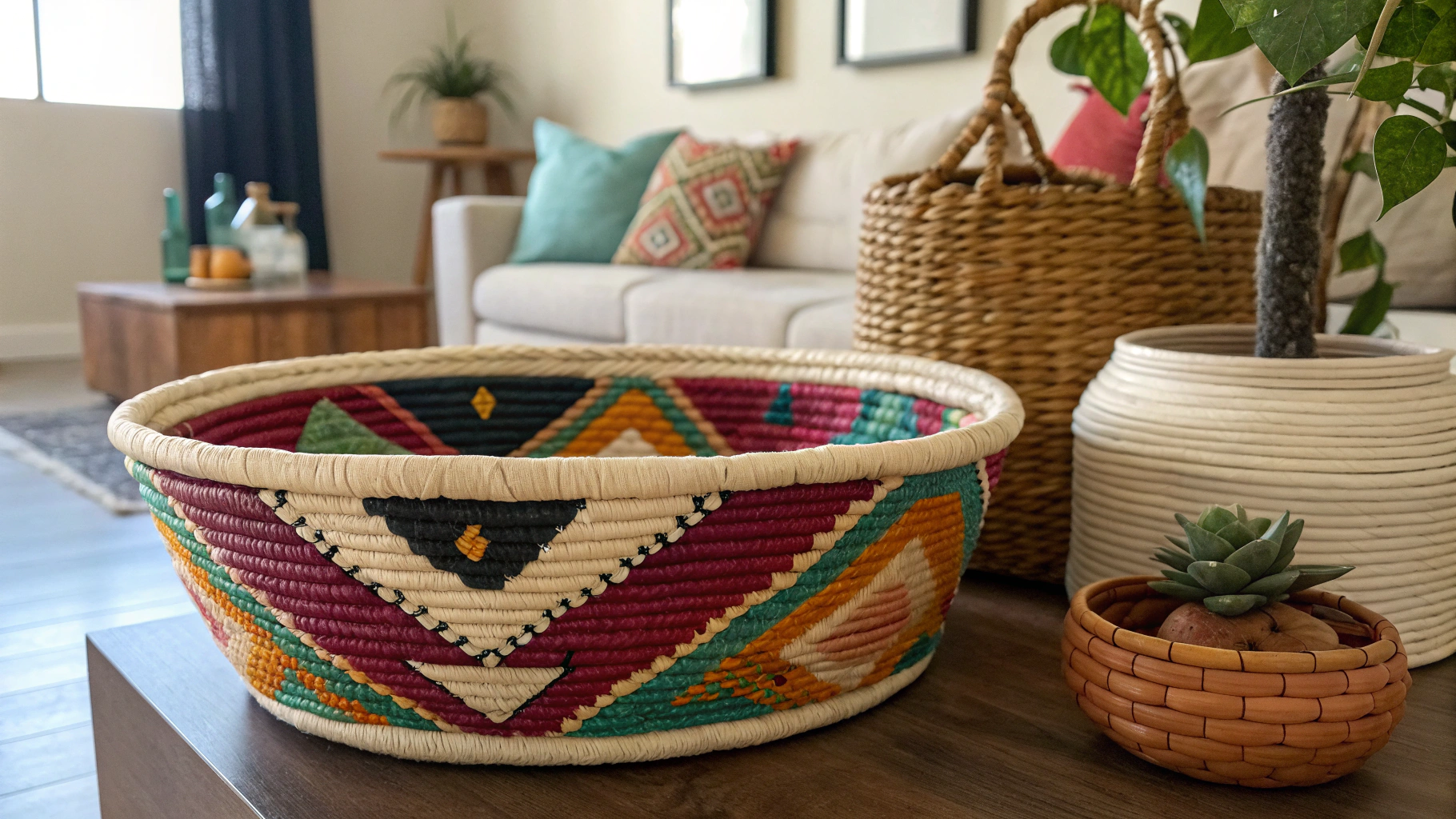
6. Woven Baskets and Smooth Stone Pairing
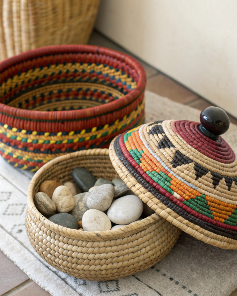
Fiber plus stone creates grounded elegance.
• Style woven containers on stone or concrete surfaces
• The soft weave offsets the cool smooth base
• Excellent for kitchens and console tables
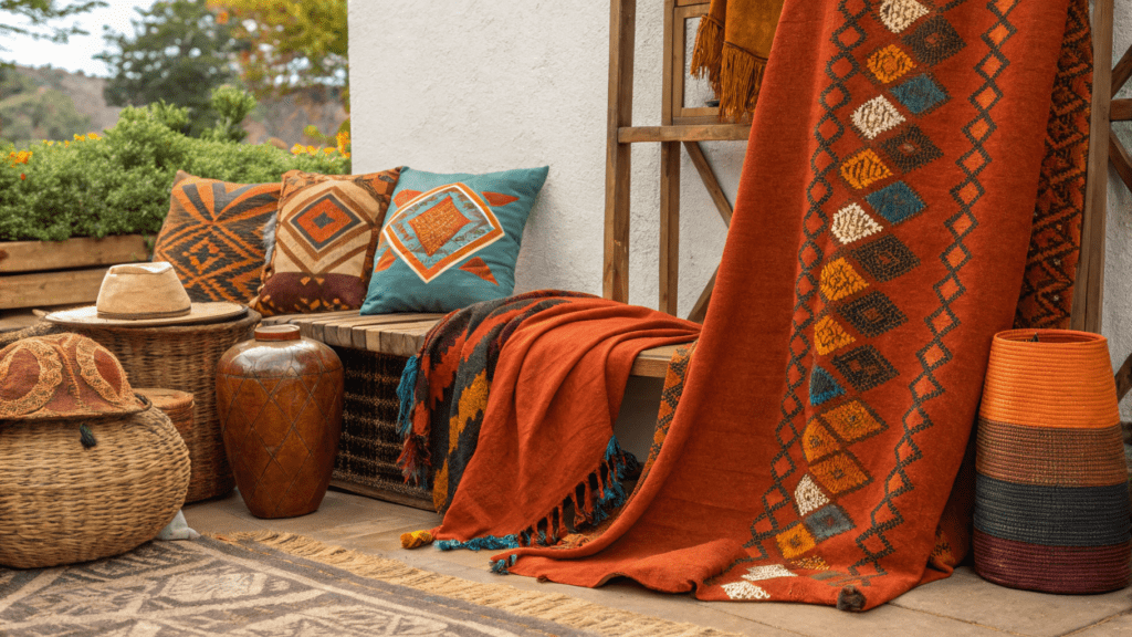
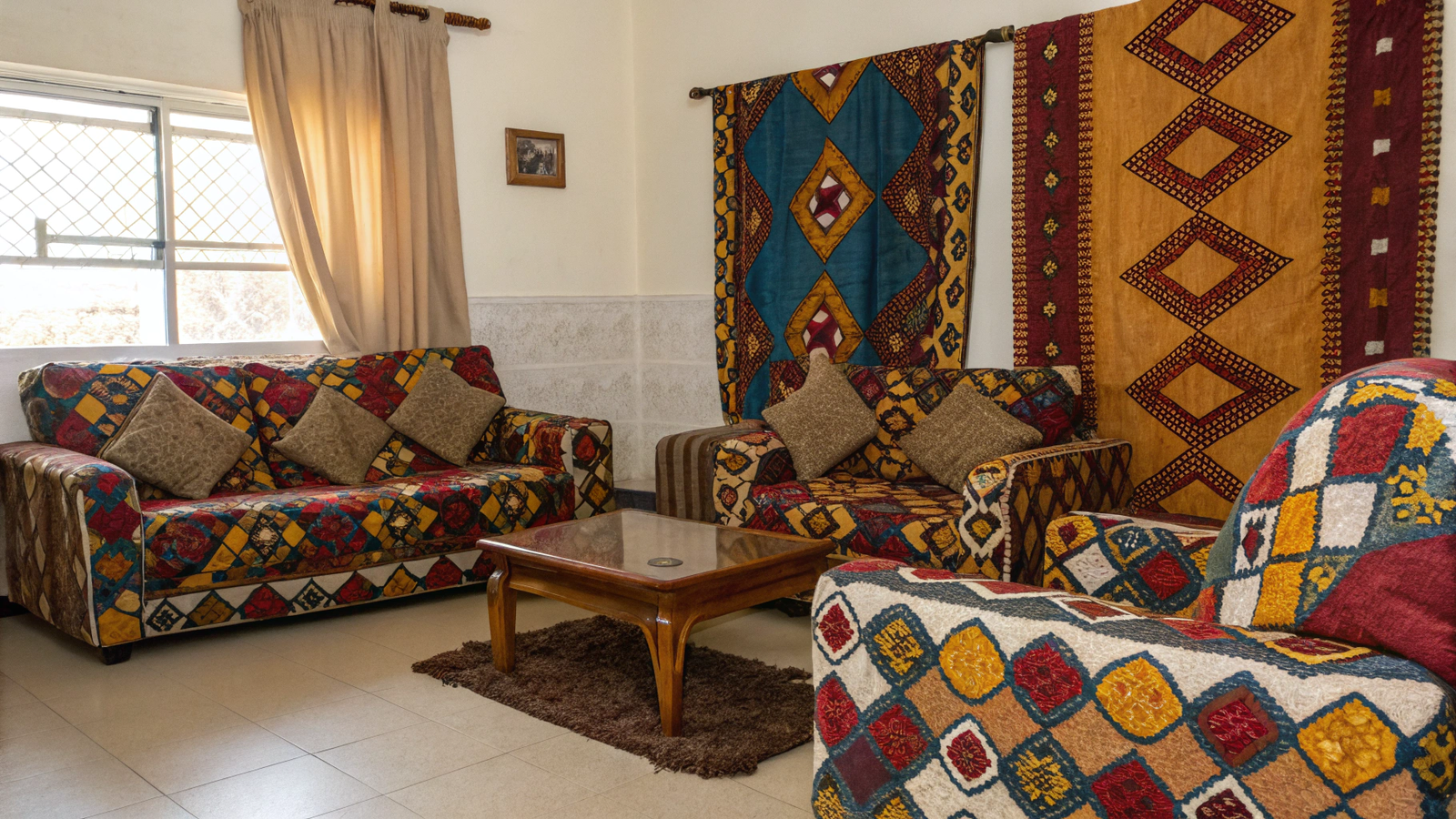
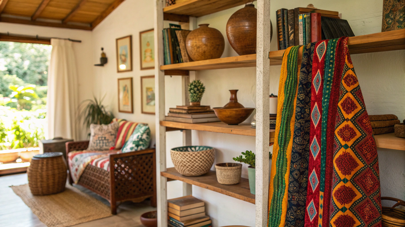
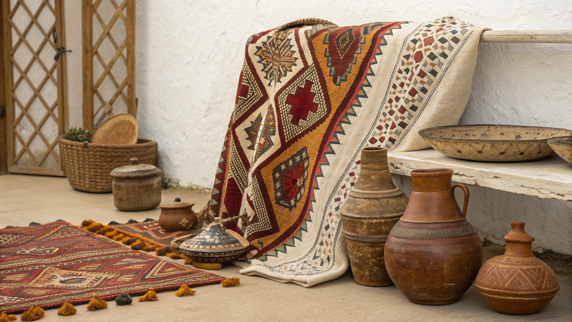
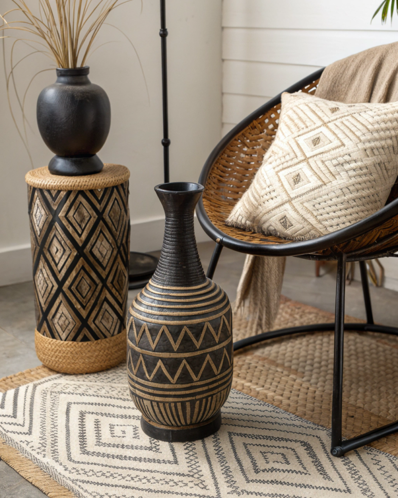
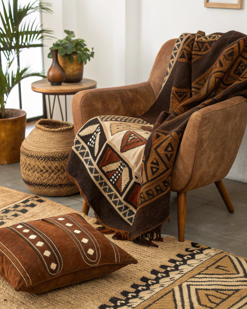
7. Leather and Handwoven Textile Pairing
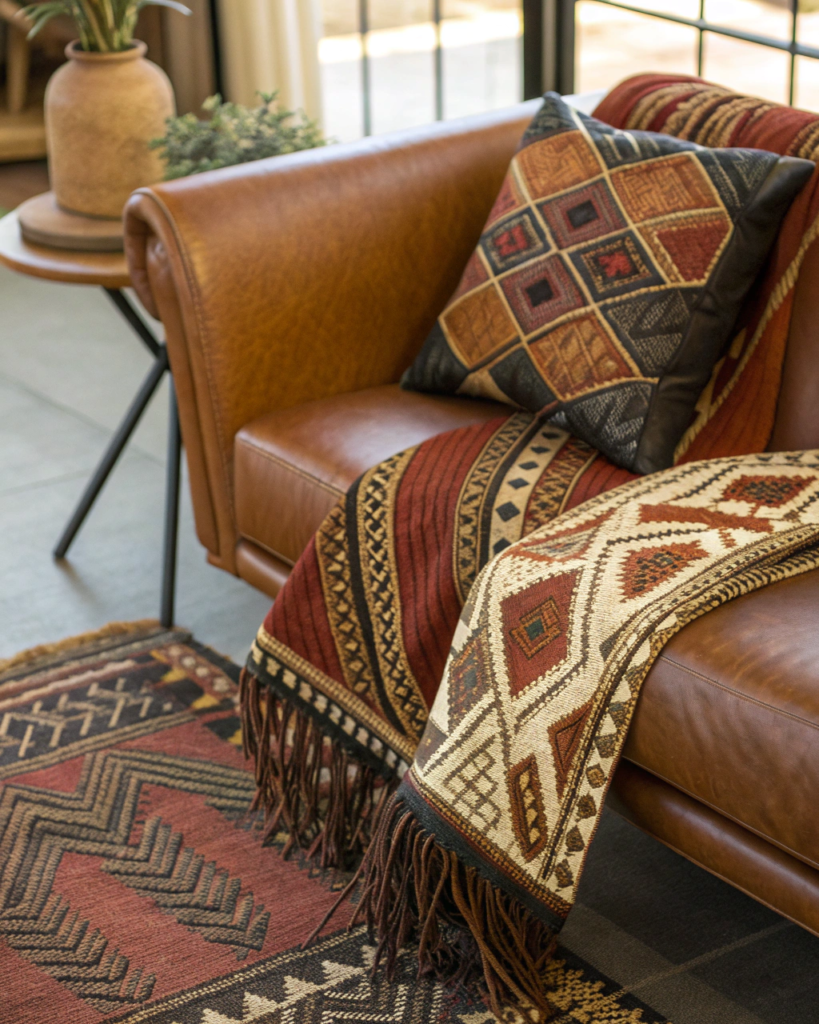
Supple surface plus pattern rich fabric adds depth.
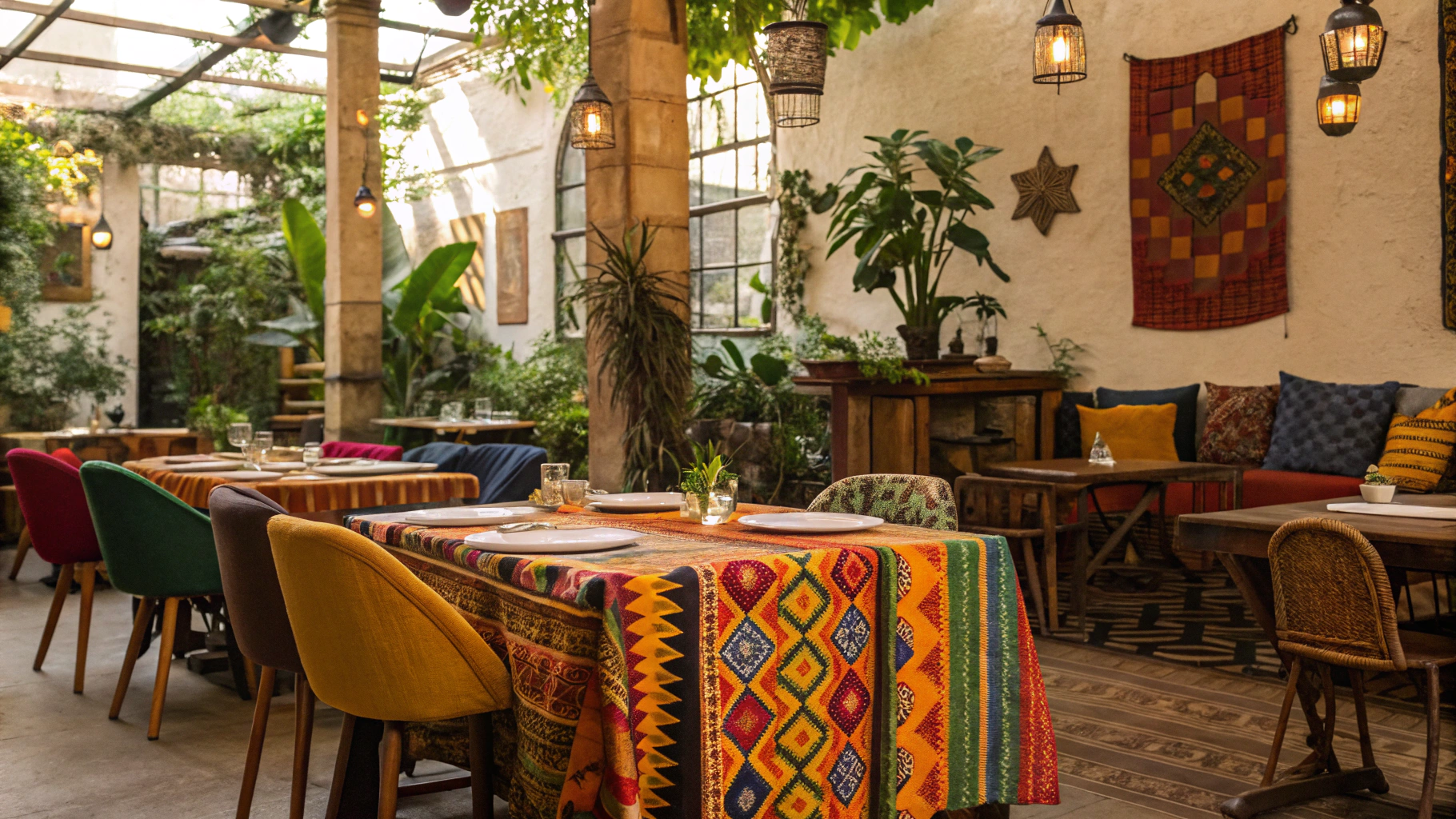
• Combine leather chairs or poufs with tribal textiles
• Choose warm brown or tan leather tones
• Let textiles bring pattern while leather brings weight
8. Rattan and Ceramic Pairing
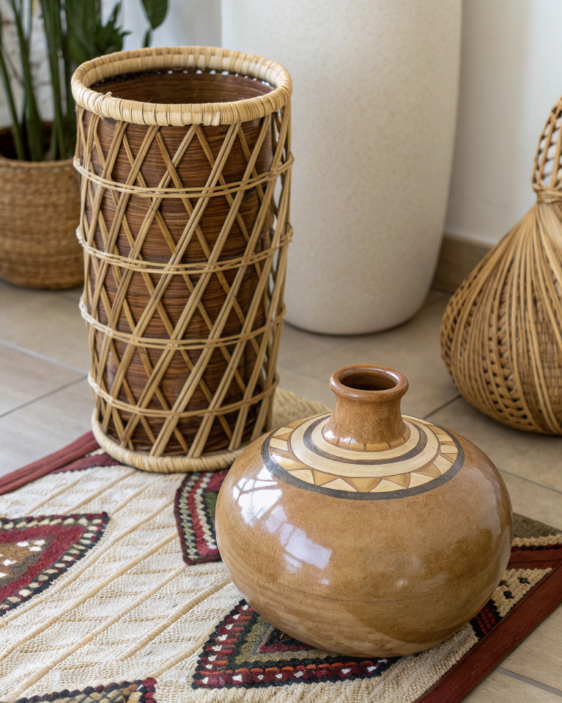
Airy weave plus solid form keeps displays balanced.
• Place ceramic vessels inside or beside rattan trays
• Mix rounded shapes for harmony
• Great for shelf and tabletop styling
9. Chunky Knit and Carved Wood Pairing
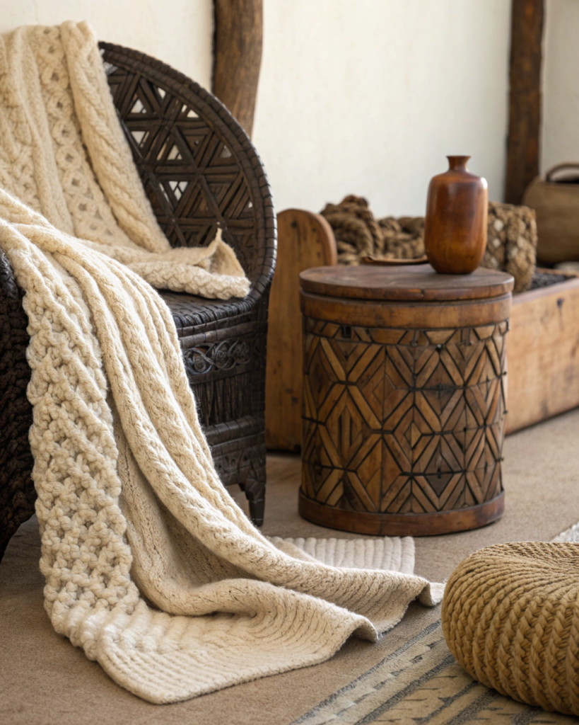
Heavy soft texture plus detailed structure feels cozy and crafted.
• Drape chunky knit throws over carved benches
• Let fabric soften sharp carved lines
• Ideal for lounge areas
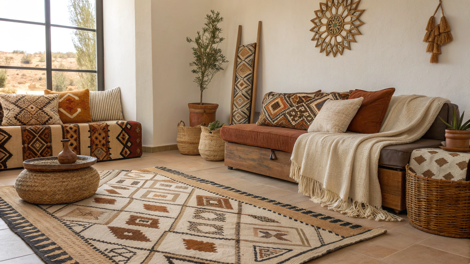
10. Seagrass and Linen Upholstery Pairing
Natural floor texture plus soft seating works effortlessly.
• Use seagrass or jute under linen sofas or chairs
• Keep upholstery tones warm neutral
• Adds layered calm without pattern overload
11. Beaded Decor and Matte Clay Pairing
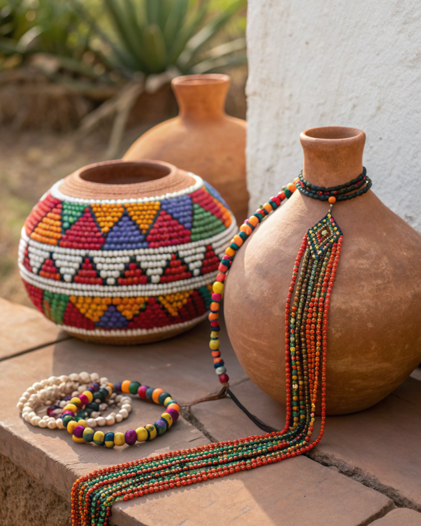
Small detail texture plus broad matte surfaces create rhythm.
• Use wood or clay bead strands near clay pots
• Vary scale between the two textures
• Works well in tabletop styling
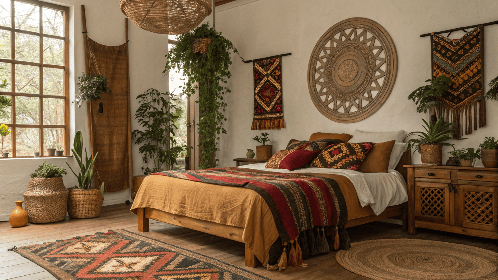
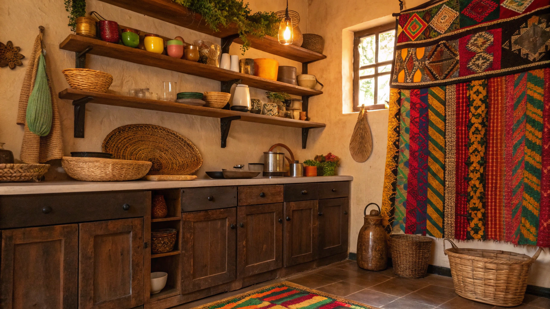
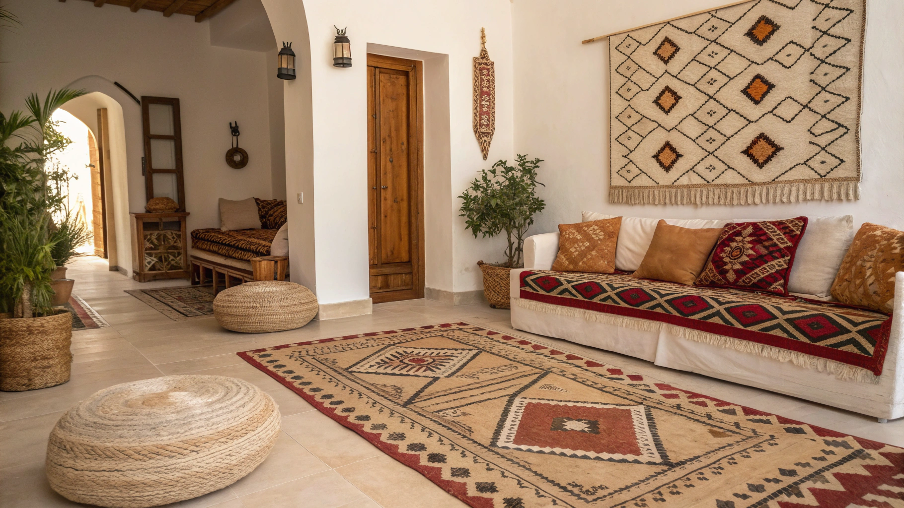
12. Rough Plaster Walls and Soft Textiles Pairing
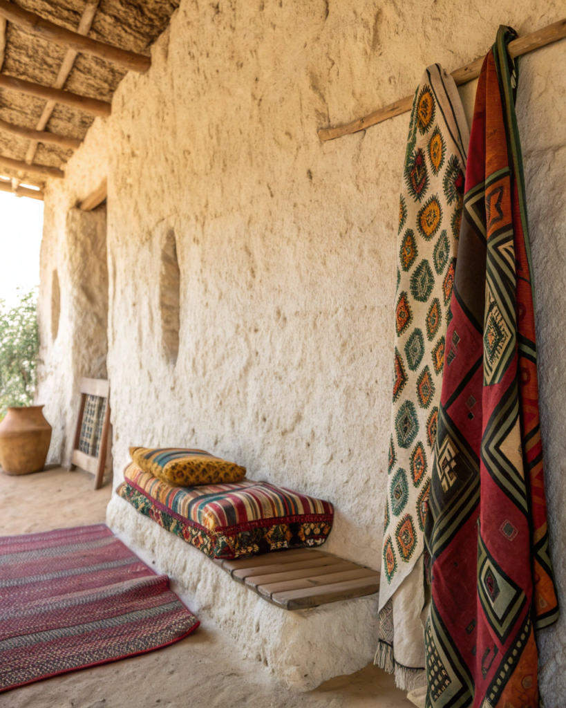
Architectural texture plus fabric softness adds dimension.
• Pair textured plaster or limewash walls with woven hangings
• The softness prevents walls from feeling harsh
• Excellent for bedrooms and living rooms
13. Woven Cane and Dark Metal Pairing
Light weave plus dark structure gives contrast clarity.
• Use cane panels with black or bronze frames
• The frame defines the softness of the weave
• Good for cabinets and chairs
14. Wool Rugs and Smooth Wood Floors Pairing
Dense fiber plus clean wood grain grounds a room.
• Choose thick wool rugs with visible texture
• Let wood flooring remain visible around edges
• Adds warmth without visual clutter
15. Basket Weave and Glass Pairing
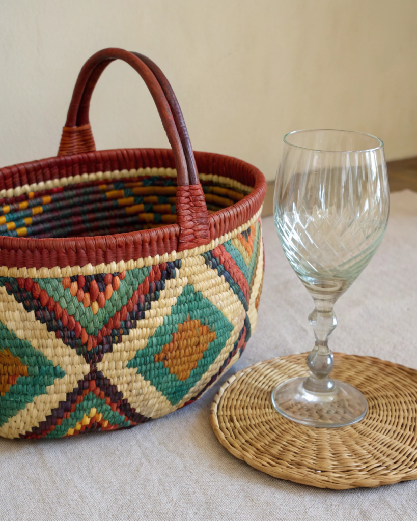
Organic opacity plus transparency adds balance.
• Place glass vases or jars inside woven trays
• The contrast highlights both materials
• Keeps heavy textures from feeling dense
16. Suede and Tribal Pattern Pairing
Velvety surface plus graphic pattern feels rich and layered.
• Combine suede pillows with tribal print textiles
• Keep colors related to avoid visual conflict
• Use in small doses for impact
17. Driftwood and Cotton Fabric Pairing
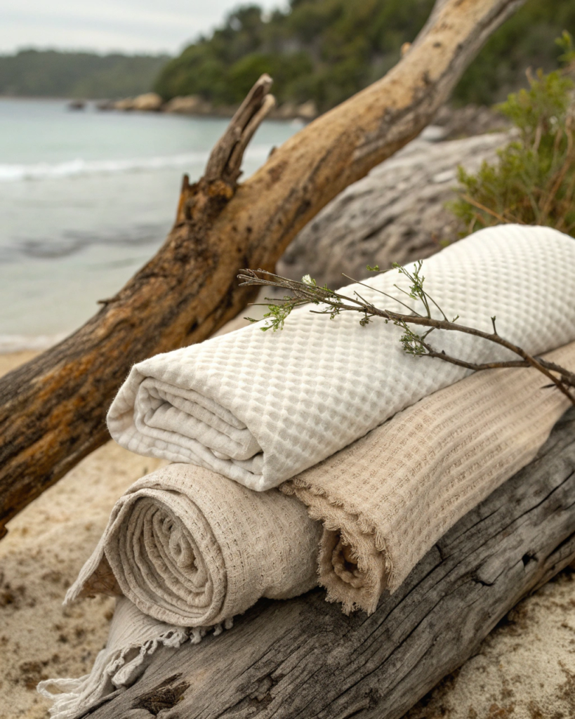
Weathered texture plus clean fabric adds relaxed character.
• Style driftwood objects near cotton cushions or runners
• The aged surface adds story
• Works well in coastal Afrobohemian blends
18. Layered Rugs With Mixed Weaves Pairing
Texture can pair with texture when weave differs.
• Layer flatweave rugs over chunky fiber bases
• Keep color families aligned
• Vary weave scale clearly
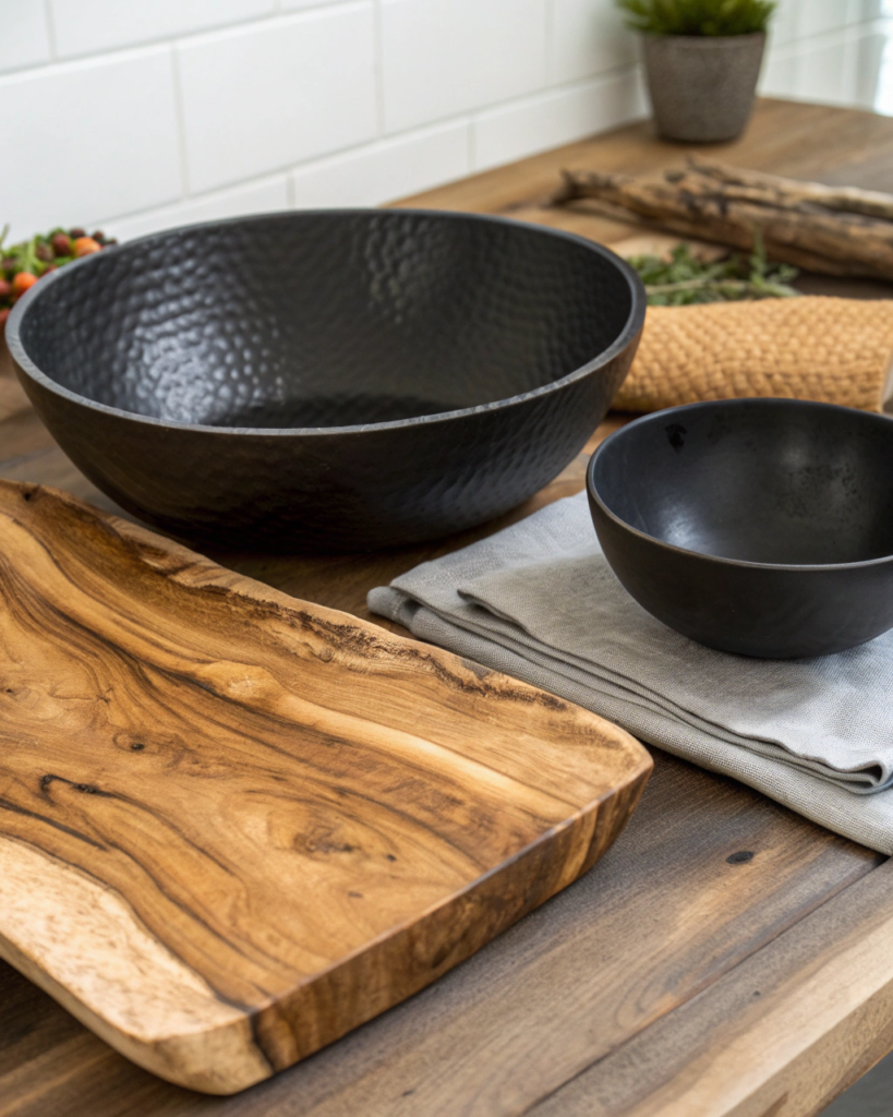
19. Hammered Metal and Wood Pairing
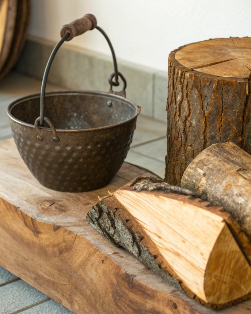
Subtle shine plus matte grain creates material contrast.
• Use hammered brass or bronze bowls on wood tables
• The light reflection adds life among matte textures
• Repeat metal tone in small accents
Final Thoughts
Afrobohemian texture pairing works when contrast is intentional and warmth is consistent. Mix soft with rough, woven with solid, matte with gently reflective. Repeat materials across the space so pairings feel connected rather than random.
FAQs
How many textures should be in one room
Three to five distinct textures usually creates strong depth.
Should textures match exactly
No. Contrast creates interest while color warmth creates unity.
What is the safest base texture
Natural wood and woven fiber work almost anywhere.
Can too many textures feel busy
Yes, if scale and color are not controlled.
How do I balance heavy textures
Add soft textiles and visible negative space.
- 12 Small Guest Room Ideas People Love - March 13, 2026
- 18 Thoughtful Guest Room Ideas Your Friends and Family Will Appreciate - March 13, 2026
- 16 Easy Ways to Make Your Guest Bedroom Feel More Inviting - March 13, 2026