How the analogous colour scheme generator works
An analogous scheme uses colours that sit next to each other on the colour wheel, such as green, blue-green and blue. Pick a base colour, the room and the mood, and the generator builds a full palette for it: the walls, the trim and ceiling, the sofa or other large furniture, the rug and curtains, and two accents. A second tab checks three colours you already have, and tells you whether they work as an analogous scheme.
What makes an analogous scheme work
Analogous colours look related, so the scheme feels calm and easy. That is also its weakness. With no strong contrast in colour, the room can look flat. The cure is to bring contrast from other places.
- Lightness. Use a pale wall, a mid-tone rug and a deep accent. The generator runs the palette from light to dark.
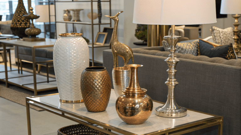
- Texture. Linen, wool, wood, rattan and ceramics add depth that colour does not.
- A neutral. White, cream or wood gives the eye somewhere to rest.
- One colour in charge. Use about 60% of your main hue, 30% of one neighbour and 10% of the other.
How the palette is built for each room
| Room | Walls |
|---|---|
| Living room | Your main colour, so the room feels like one calm space |
| Bedroom | The cooler neighbour, for a restful feel |
| Kitchen or dining room | The warmer neighbour, for a welcoming feel |
| Bathroom | The cooler neighbour, very light, for a clean look |
| Home office | A deep version of your main colour, to help you focus |
The spread sets how far the neighbours sit from your base. Narrow, at 20 degrees, is the quietest. Standard, at 30 degrees, is the classic analogous range. Wide, at 45 degrees, adds more variety.
Worked examples
An olive green, #8B9A73, for a living room, balanced, standard spread
The walls are #D8DCD0, with the ceiling and trim in #F2F4F5. The sofa is #66774B, the rug and curtains #B1AE96, and the two accents are #64A45B for cushions and #414C2E for art and lamps. The palette runs from an LRV of about 70 on the walls to about 6.5 on the deepest accent, so there is plenty of depth.
A blue, #34508A, for a bedroom, calm and light
The walls lean to the cooler neighbour, a soft teal, at #DBE4E6. The bed or sofa is #546892, the rug and curtains #9993B3, and the accents are #559BAA and #2C374F. The trim is #F2F4F5.
Checking three greens
A pale sage, #B7C4A0, a mid green, #6F9A6B, and a deep green, #2F5F4C, span about 75 degrees of the wheel and about 43 LRV points of lightness. That is a good analogous scheme, with enough depth to avoid looking flat.
Three colours that are too similar
An olive, #8B9A73, with #8FA373 and #8F9A7B span only about 4 degrees and 3 LRV points. They match, but the room would look dull. The tool suggests a pale tint for the walls and a deep shade for the accents.
Common mistakes
- Using colours of the same lightness. They merge into one flat mass. Vary the depth.
- Going too wide. If the hues are more than about 90 degrees apart, one colour will look out of place.
- Forgetting texture. A tonal room needs it more than any other kind.
- Not adding a neutral. White, cream or wood rests the eye.
- Making all three colours equal. Let one lead, and the others support.