How the 60-30-10 palette generator works
Pick the main colour for your room, usually the wall colour, then choose a colour scheme and a mood. The generator suggests a secondary colour and an accent colour, shows all three in a sample room, and tells you which parts of the room to use each colour for. You can change the secondary or accent colour to try your own, and the checks update at once.
What is the 60-30-10 rule?
The 60-30-10 rule is a classic decorating guide that tells you how to balance the colours in a room:
- 60% main colour covers the largest areas, such as the walls, ceiling and a big rug. It sets the mood.
- 30% secondary colour supports the main colour. It is used on furniture, curtains and other medium-sized things.
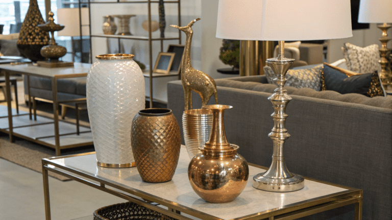
- 10% accent colour is the pop of interest, in small things like pillows, art, vases and candles.
The proportions are a guide for what you see in the room, not an exact area. They stop a room from feeling busy, because the eye has one calm background, one supporting colour and a little excitement.
Choosing a colour scheme
| Scheme | How it works | Feel |
|---|---|---|
| Complementary | The accent is opposite the main colour on the colour wheel | Bold and energetic |
| Analogous | The colours sit next to each other on the wheel | Calm and flowing |
| Split complementary | The accent is on either side of the opposite colour | Lively, but easier than complementary |
| Triadic | The colours are evenly spaced around the wheel | Playful and colourful |
| Monochrome | One colour in light, medium and strong tones | Elegant and calm |
Where each colour goes
Living room
60%: walls, ceiling, a large rug and the sofa. 30%: armchairs, curtains, side tables and shelves. 10%: throw pillows, blankets, vases, candles and small art.
Bedroom
60%: walls, bed linen and a large rug. 30%: the headboard, curtains and bench. 10%: accent pillows, lamp bases, art and plants.
Kitchen or dining room
60%: walls, cabinets or backsplash, and floor. 30%: the island or lower cabinets and stools. 10%: pendant lights, hardware, flowers and accessories.
Neutrals do not count
Most rooms also have white, black, wood and metal. These work as neutrals, and they do not take up a share of the three colours. A white ceiling and a wood floor sit quietly in the background, so you can still use the rule for the rest of the room.
Common mistakes
- Making the accent too big. If the accent is on a whole wall or a large sofa, it becomes the main colour.
- Choosing colours of the same lightness. If the main and secondary colours are equally light or dark, the room looks flat. Make one lighter or darker.
- Making the accent too like the main colour. It must stand out, with a different colour or a stronger shade.
- Choosing from a screen. Colours look different on a phone and in your light. Test a paint sample on the wall first.
- Using the rule too strictly. It is a guide. Use your eye, and change the proportions if the room feels wrong.
Tips for a better palette
- Start from something you love, such as a rug, a painting or a sofa, and build the palette around it.
- Repeat the accent colour in at least three places around the room, so it looks planned.
- Add texture (wood, linen, wool, metal) to stop a calm palette from looking flat.
- In a small room, choose a light main colour. In a large room, you can use a deep one.
- Test the palette in the morning and in the evening, with natural and artificial light.