16+ Neutral Deck Decor Themes That Feel Calm and Stylish
Neutral deck decor is not the safe choice. It is the sophisticated one. A deck designed around a considered neutral palette feels calmer, more spacious, more timeless, and more genuinely beautiful than one cluttered with competing colors. The challenge is making neutral feel rich and layered rather than flat and forgettable. These ideas show you exactly how to do it.
Why Neutral Deck Decor Works So Well Outdoors
There is a reason that the most beautiful and most enduring outdoor spaces almost always work within a neutral palette. Neutrals do something outdoors that they do in very few other contexts. They compete well with the natural world rather than fighting against it.
Nature Is Already the Color
When you decorate a deck in bold colors, you are adding competing color statements to a backdrop that is already full of color. The green of the planting, the blue of the sky, the warm amber of timber, the soft grey of stone. These natural tones are already present in abundance. A neutral deck palette works with these natural colors rather than against them, allowing the natural setting to provide the color interest while the deck itself provides the calm, considered base that makes everything look more intentional.
Neutrals Age More Gracefully
Bold color choices in outdoor decor fade, go out of fashion, and require updating more frequently than neutral ones. A deck decorated in a strong trending color that looked perfect in the season it was chosen can look dated within a few years as the trend passes and the color fades in the sun. A neutral palette, by contrast, improves with a little weathering, never feels particularly of its moment, and can be refreshed very easily by changing small accent elements without ever needing to rethink the whole scheme.
They Create a Better Backdrop for Entertaining
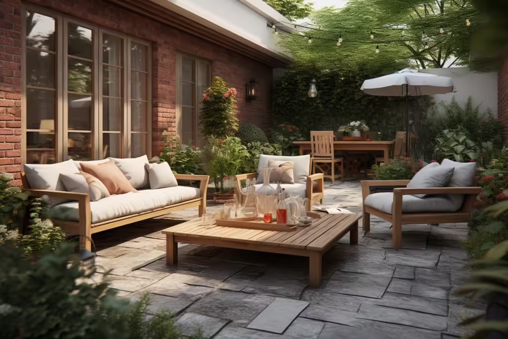
A neutral deck is the most flattering and most socially comfortable backdrop for outdoor entertaining. People, food, drinks, and candlelight all look their best against a calm, neutral setting. A bold, color-saturated deck competes with the people and the occasion in a way that neutrals never do. The best entertaining spaces are ones where the guests feel like the most important visual element, not the decor.
They Allow Seasonal Updates Without a Full Rethink
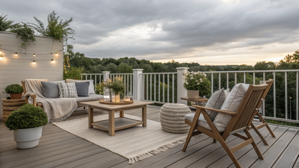
A neutral base palette on a deck can be seasonally refreshed by changing a single layer of accessories without touching the furniture or structural elements. Swap warm cream cushions for deeper taupe ones in autumn. Change a cotton throw from ivory to a warm camel tone in cooler months. Add a deep charcoal lantern for autumn evenings. These small seasonal adjustments within a neutral framework keep the deck feeling fresh and current without ever requiring a fundamental rethink of the whole scheme.
What Makes a Neutral Palette Work
Understanding the building blocks of a successful neutral deck palette helps you make choices that feel rich and considered rather than empty and bland.
Not All Neutrals Are Equal
Neutral does not mean colorless. The most sophisticated neutral palettes contain undertones that give them warmth, depth, and character. A warm cream has yellow undertones that relate to natural timber and sunlight. A cool grey has blue undertones that relate to stone and sky. A sandy taupe has earthy pink undertones that relate to terracotta and certain natural timbers. Understanding the undertones of your neutrals and making sure they all point in the same direction, consistently warm or consistently cool, is the difference between a neutral palette that feels cohesive and one that feels muddy and unresolved.
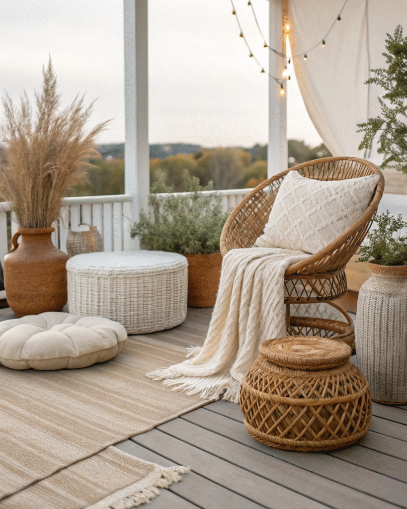
Texture Is What Makes Neutral Interesting
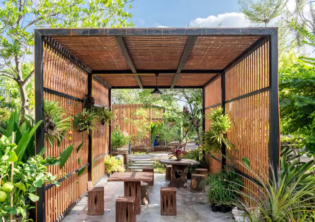
In a bold color scheme, the colors provide the visual interest. In a neutral scheme, texture does the work. Smooth stone against rough linen. Fine timber grain against woven rattan. Matte concrete against glossy ceramic. The interplay of different surface textures within a neutral palette is what creates the richness and depth that prevents neutrals from feeling empty. A neutral deck with only one or two surface textures will feel flat and underdeveloped regardless of how well-chosen the individual colors are.
Vary the Tone Within the Palette
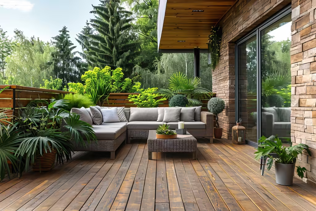
A palette of all exactly the same neutral tone creates no visual interest and makes the space feel uniformly bland. The most successful neutral schemes use a range of tones within the same color family. A lightest tone, typically off-white or the palest neutral, for cushions and light textiles. A medium tone for the main furniture. A darker tone for accents, the rug, a planter, a side table. This tonal variation within a neutral family creates depth and visual hierarchy without introducing any color that would disrupt the calm, cohesive quality of the scheme.
Add One Natural Material Per Layer
The most effective neutral deck schemes layer natural materials rather than relying on paint and manufactured finishes to provide interest. Natural timber for the structure. Natural stone for a surface or planter. Natural rattan for a chair or tray. Natural linen or cotton for textiles. Each natural material has its own texture, grain, and inherent neutral tone that contributes to the palette without introducing manufactured color. Natural materials are the secret ingredient in every neutral scheme that feels genuinely beautiful rather than merely inoffensive.
How to Build a Neutral Deck Palette From Scratch
Whether you are starting from a blank deck or re-toning an existing one, working through these stages in order produces the most cohesive results.
Stage One: The Fixed Neutral
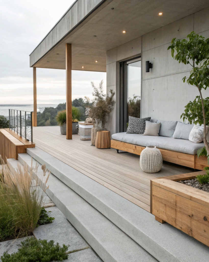
The deck boards, railings, and any built-in structures form the fixed neutral of the scheme. If you are designing from scratch, choose a deck material and finish in a tone you want to live with for many years, typically a warm natural timber tone, a cool grey composite, or a pale natural stone. If you are working with an existing deck, assess its dominant tone and decide whether you are building a warm neutral scheme around it or a cool one.
Stage Two: The Furniture Neutral
Choose furniture in a tone that relates to the fixed neutral without exactly matching it. A slight tonal contrast between the deck surface and the furniture creates definition and visual interest. Natural teak furniture on a grey composite deck. Powder-coated sand furniture on a warm timber deck. Cool white furniture on a pale natural stone patio. The furniture neutral should be the second-darkest tone in the scheme.
Stage Three: The Textile Layer
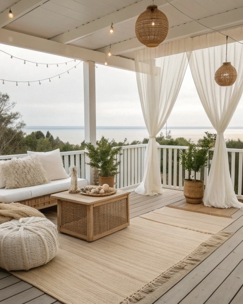
Cushions, a rug, and throws are the textile layer and typically the lightest tones in the scheme, providing brightness and freshness against the slightly deeper furniture and deck tones. Off-white, ivory, warm cream, and pale linen tones are the classic choices at this stage and they relate naturally to natural daylight and the bleached, airy quality of the best outdoor spaces.
Stage Four: The Accent Neutral
The darkest neutral in the scheme, used sparingly in a planter, a side table, a lantern, or a structural element, provides the depth and contrast that stops the scheme from feeling too pale and insubstantial. Charcoal, deep grey-brown, warm black, and dark natural stone are all excellent accent neutrals that give a pale neutral scheme its visual anchor.
Maintaining a Neutral Deck Through the Seasons
A neutral deck requires a slightly different maintenance approach from a bold-color one because the subtlety of the palette means that dirt, staining, and weathering are more visible rather than less.
Clean Regularly and Promptly
Light-toned cushions, pale decking, and natural fiber rugs all show grime more readily than dark-colored equivalents. Regular maintenance cleaning, brushing cushions weekly, hosing down the deck boards fortnightly, and shaking out rugs, prevents the gradual buildup of dust and organic debris that makes pale neutral surfaces look dingy and neglected over time.
Seal Natural Materials
Natural stone, unsealed timber, and unfinished concrete in a neutral scheme should be sealed with appropriate exterior-grade sealers to reduce their porosity and susceptibility to staining. A sealed neutral surface is far easier to keep looking clean than an unsealed one and the sealer preserves the pale, fresh quality of the material that is the whole basis of the scheme.
Store Pale Textiles Carefully
Pale cushions and rugs store particularly well through the off-season if they are cleaned completely before storage, dried thoroughly, and stored in breathable bags rather than sealed plastic. Pale textiles that go into storage with any residual moisture or soiling will come out with mildew stains that are very difficult to remove completely and that compromise the fresh, clean quality that is the foundation of a neutral scheme.
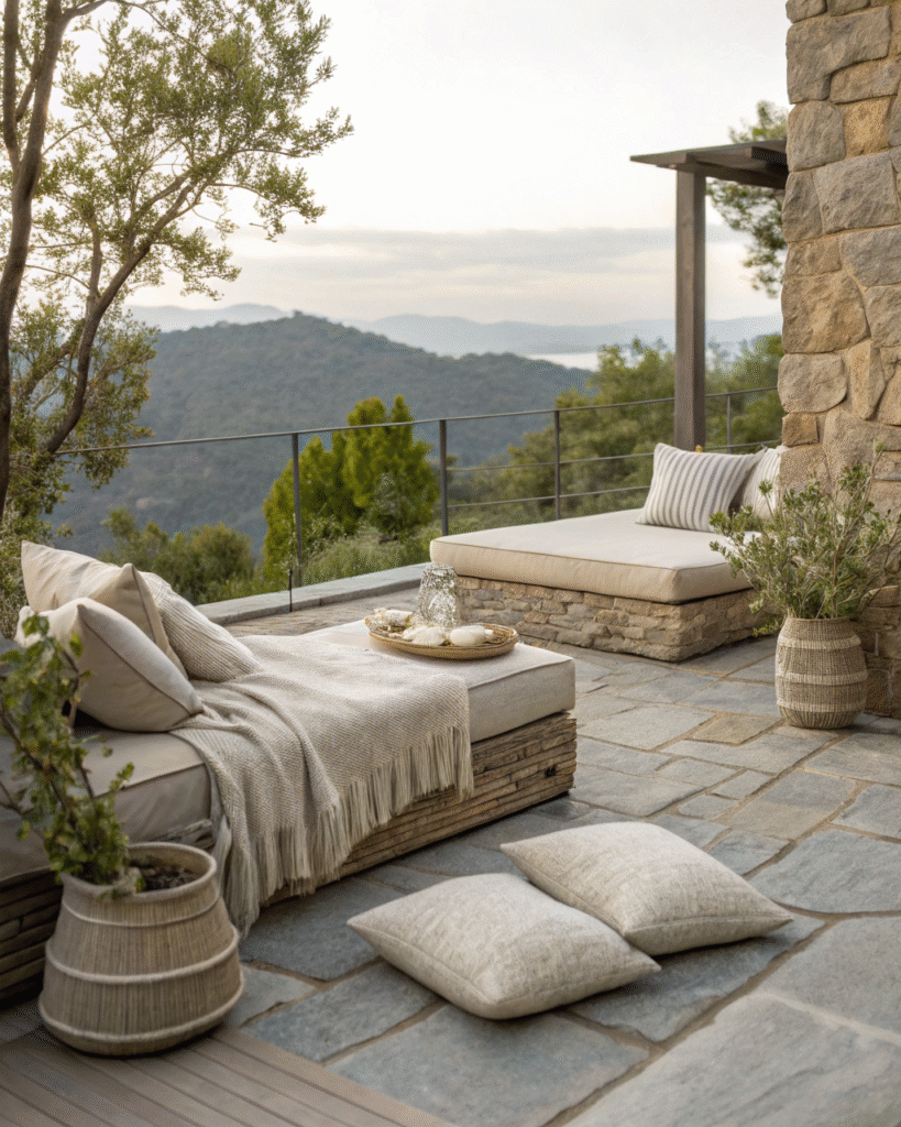
1. Beige and White Palette
A beige and white combination creates a clean, airy atmosphere that feels relaxed.
Pro Tip: Layer in light wooden furniture to add warmth without breaking the palette.
2. Gray on Gray Layers
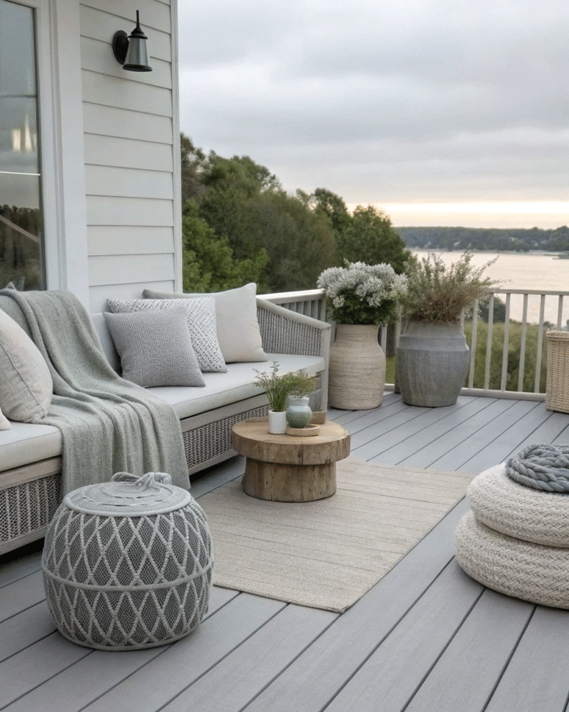
Soft gray tones add depth while keeping the mood serene and balanced.
Pro Tip: Mix matte and textured finishes for a sophisticated, modern look.
3. Natural Wood Accents

Wood elements bring organic warmth to neutral setups.
Pro Tip: Use light stains like oak or ash to maintain a calm and inviting tone.
4. Cream and Taupe Pairing
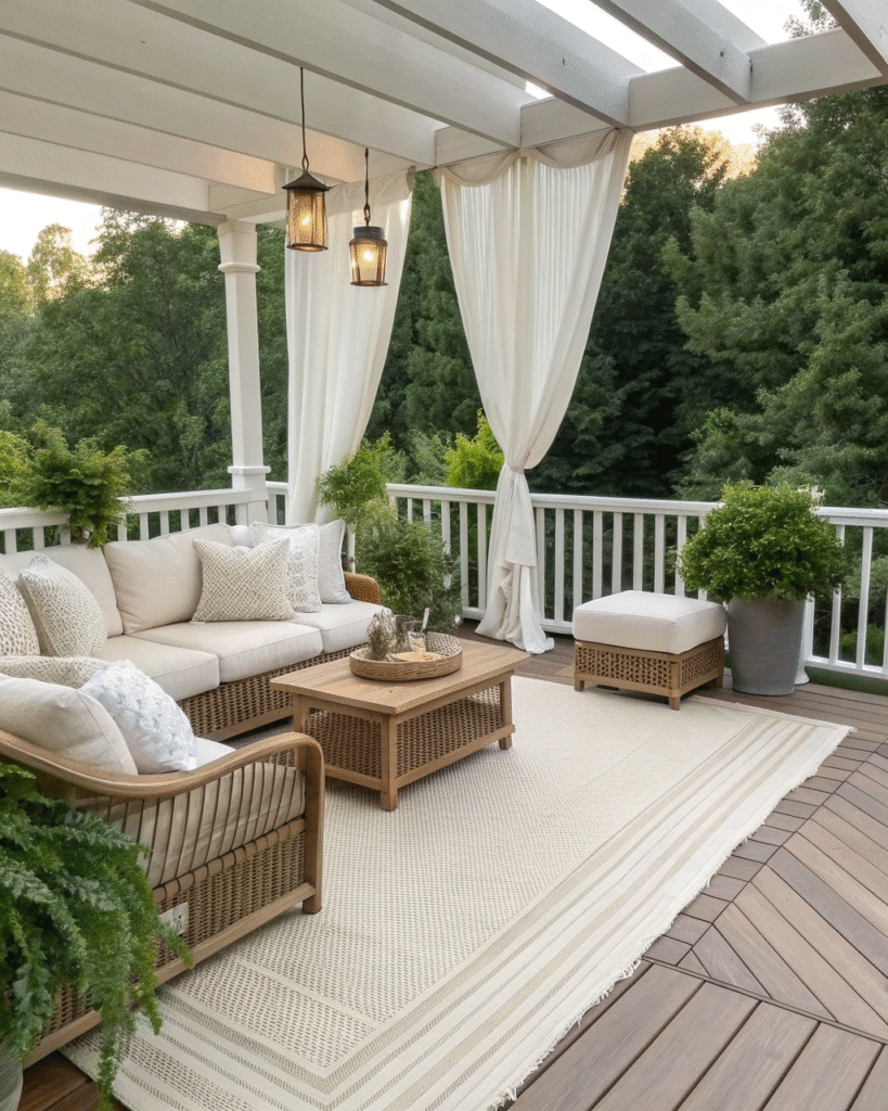
Cream and taupe are elegant together and instantly make your deck feel cozy.
Pro Tip: Add woven details through rugs or throws for a subtle texture lift.
5. Black and Sand Contrast
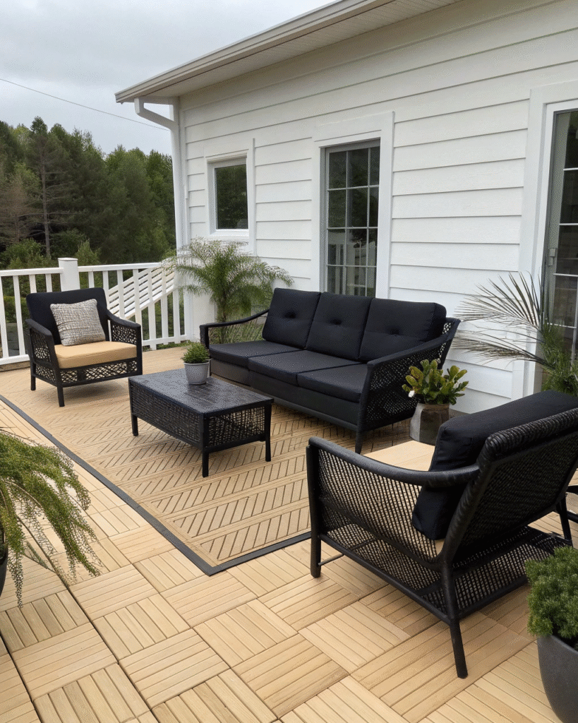
Black furniture against sand-colored decor feels modern yet grounded.
Pro Tip: Keep black accents minimal to maintain a soft, balanced aesthetic.
6. Whitewashed Finishes
Whitewashed wood brings a rustic yet fresh touch to neutral patios.
Pro Tip: Pair with linen fabrics and light ceramics for a breezy coastal vibe.
7. Stone and Linen Combo
Stone textures paired with linen fabrics create quiet sophistication.
Pro Tip: Stick to gray and beige tones for a soft, timeless result.
8. Minimal Scandinavian Style
Keep furniture sleek and clutter-free for a Scandinavian-inspired deck.
Pro Tip: Focus on simple shapes and warm neutrals for a naturally calming look.
9. Soft Earth Tones
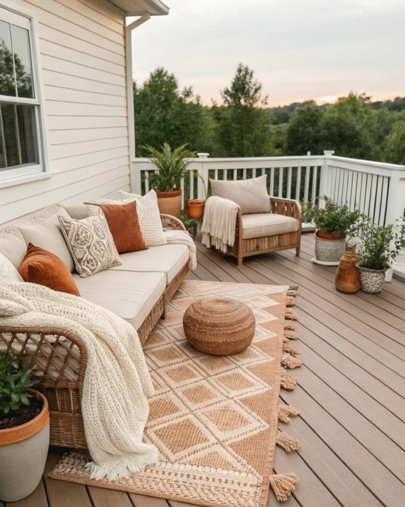
Terracotta, sand, and cream hues bring grounded warmth to your deck.
Pro Tip: Add soft cushions and clay pots to enhance the organic atmosphere.
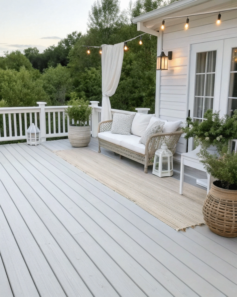
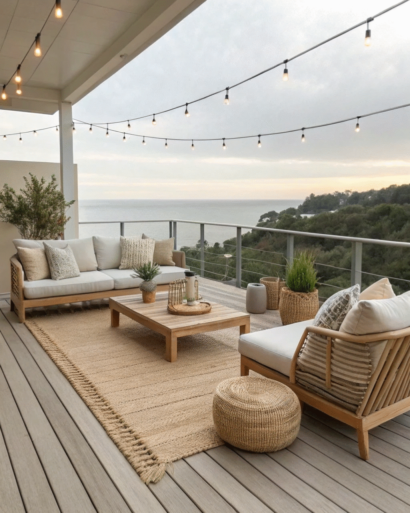
10. Coastal Neutrals
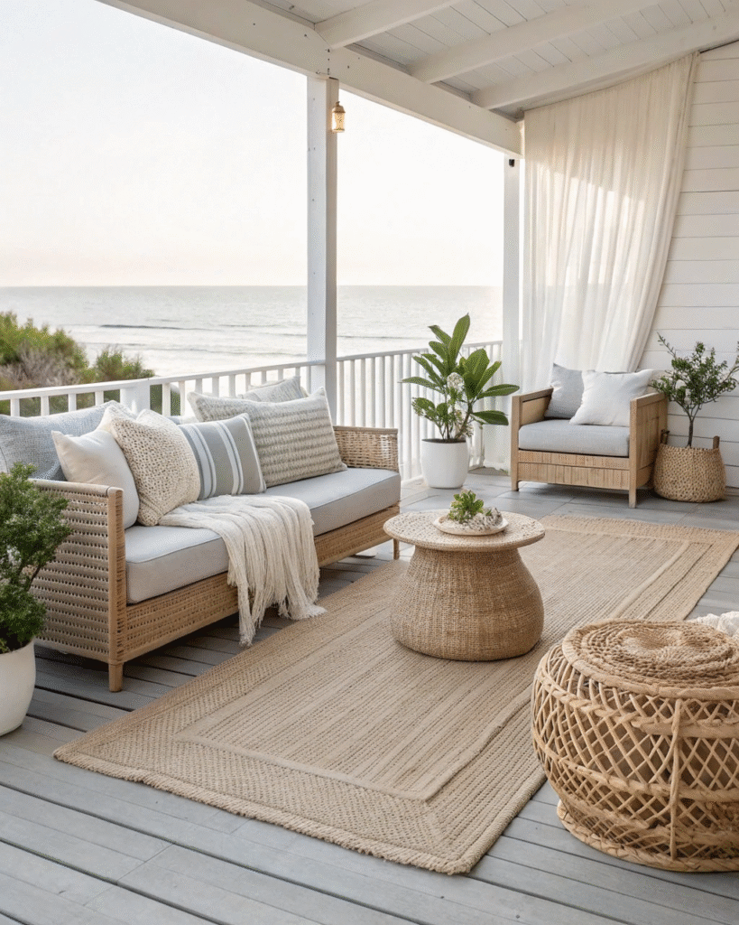
Combine whites, light grays, and natural fibers for a coastal-inspired retreat.
Pro Tip: Use rattan furniture and airy curtains for an effortless, beachy vibe.
11. Concrete and Wood Blend
Concrete paired with light wood gives your deck a modern minimalist edge.
Pro Tip: Balance the hard surfaces with soft outdoor textiles and neutral decor.
12. Woven Textures
Wicker, rattan, and jute instantly add comfort to neutral designs.
Pro Tip: Keep the palette cohesive by choosing one or two complementary tones.
13. Monochrome Neutrals

Layering a single neutral tone in different shades creates a soothing flow.
Pro Tip: Play with fabrics, finishes, and subtle patterns to avoid flatness.
14. Light Gray and Ivory

This pairing feels fresh, elegant, and easy to style year-round.
Pro Tip: Use metallic accents like brushed gold or silver for a modern touch.
15. Natural Green Accents
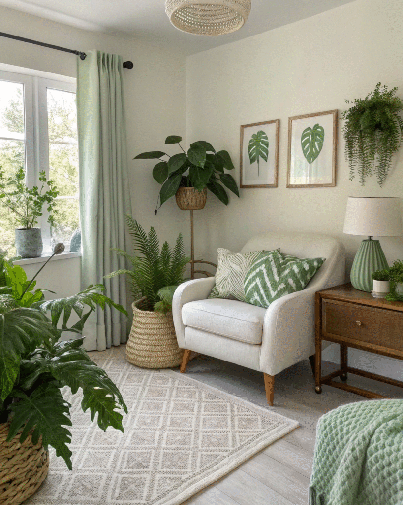
Add soft greenery to break up neutral tones while keeping the space calm.
Pro Tip: Choose potted plants with simple, sculptural leaves for a minimalist feel.
16. Neutral Boho Mix
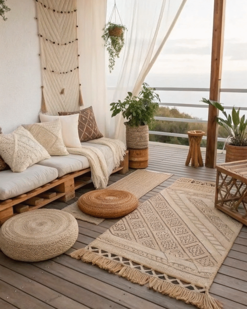
Combine earthy tones with woven rugs, cushions, and wooden details for a cozy boho look.
Pro Tip: Keep patterns subtle and let texture do most of the visual work.
Final Thoughts
A neutral deck done well is one of the most quietly stunning outdoor spaces you can create. It does not shout for attention. It simply feels right every time you step onto it, in every season, in every light, and for every occasion.
The calm it creates is not passive or empty. It is the result of careful choices, considered materials, and the discipline to let texture, tone, and natural beauty do the work that color so often tries to do less successfully.
Build your neutral palette with intention, layer it with natural materials, and let the garden provide the only color accent you will ever need.
Frequently Asked Questions
Will a neutral deck decor scheme look boring?
Not when it is done with attention to texture, tone variation, and material quality. The most beautiful neutral outdoor spaces look anything but boring because they use the full richness of natural materials, light, and texture to create visual interest without relying on color to do the work. The challenge is ensuring enough tonal and textural variety within the neutral palette to give the scheme depth and character. A neutral scheme with one tone and one texture is flat. A neutral scheme with five tones and six textures is extraordinary.
What accent color should I introduce into a neutral deck scheme?
The most successful accent for a neutral outdoor scheme is not a conventional color but a natural one. The green of living plants is the most universally complementary accent for any neutral palette and it is available for free in the garden. If a non-green accent is desired, terracotta is the most natural-feeling addition to a warm neutral scheme and deep charcoal or natural black is the most architectural addition to a cool one. Both read as extensions of the neutral palette rather than departures from it.
How do I prevent neutral deck decor from looking washed out?
Vary the tone within the neutral palette from light to dark and use natural materials with strong inherent texture. The darkest neutral in the scheme, whether a charcoal planter, a dark timber side table, or a deep grey rug, is what prevents the pale elements from washing out visually. Without this darker anchor, pale neutral schemes lose their definition and the individual elements blend together rather than reading as a considered composition.
What outdoor furniture colors work best in a neutral scheme?
Natural teak, warm-toned rattan or wicker, soft grey powder-coated aluminium, warm sand-toned composite, and off-white or natural linen upholstery are all excellent furniture choices for a neutral outdoor scheme. Avoid furniture in strong solid colors, bright white without warm undertones, and very dark charcoal or black as the dominant furniture tone, which can feel heavy in a pale neutral scheme.
How do I add warmth to a neutral deck that feels too cool?
Introduce warm-toned natural materials into the scheme: natural timber in side tables or trays, terracotta pots, jute or seagrass rugs, and natural linen or cotton textiles. Add warm-toned lighting, specifically warm white LEDs at 2700K, which casts the whole scheme in a warm amber glow after dark. A fire pit or candles in hurricane glasses add the warmest possible light source and make even a cool-toned neutral scheme feel immediately inviting on a cool evening.
Can neutral deck decor work in a garden with lots of colorful planting?
Yes, and it works particularly well. A neutral deck provides a calm visual anchor that allows the colors of the garden planting to read more clearly and more beautifully than they would against a competing colored backdrop. The neutral deck becomes the frame for the garden’s color and the planting becomes the decoration of the deck, a relationship that is more balanced and more beautiful than a colored deck trying to compete with a colorful garden.